![]() »
»
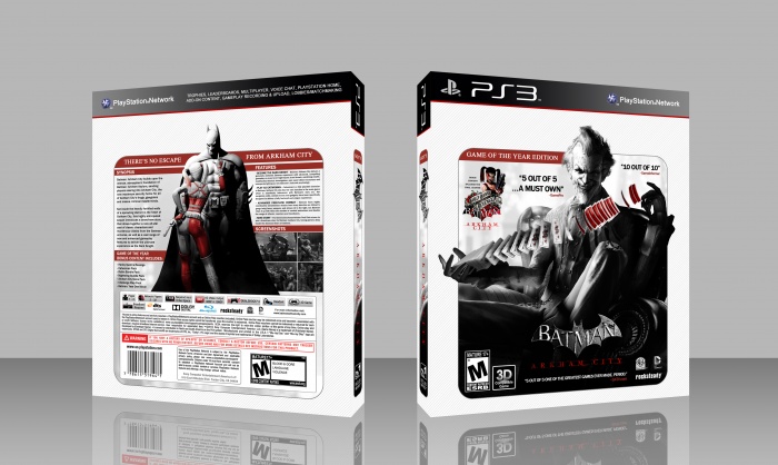
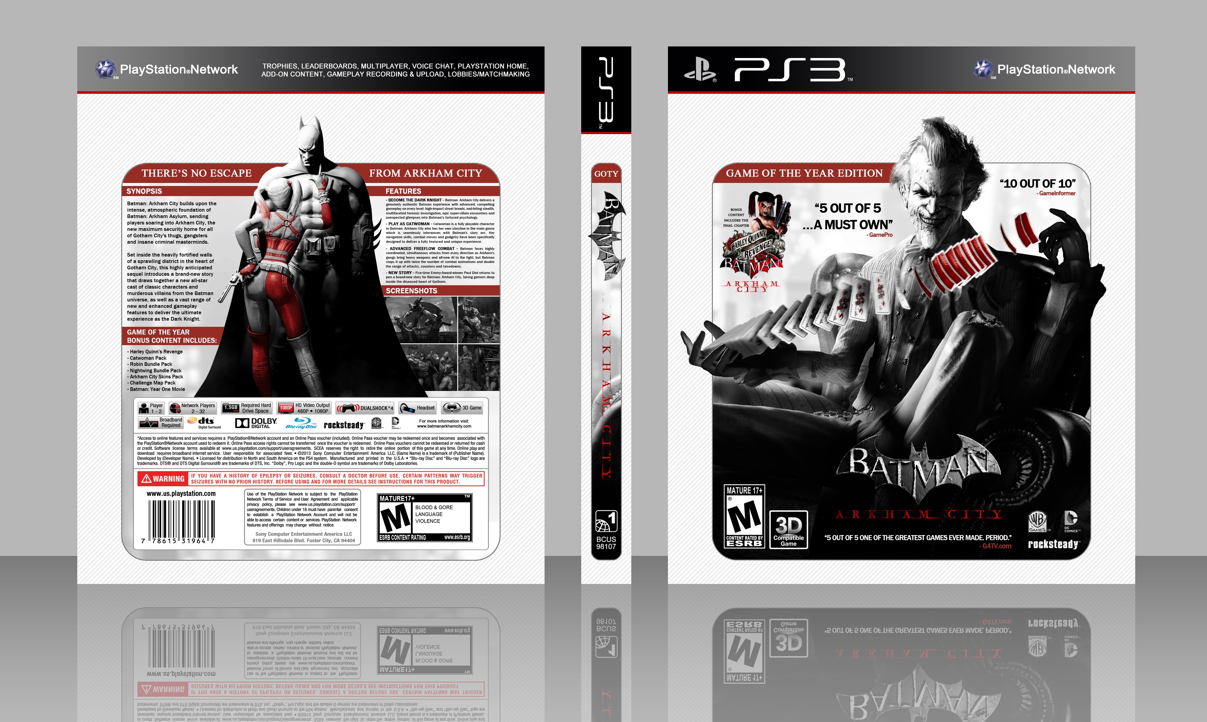
If you want to see a 2D version of this box please click on "[original]", which is right below this description.
[ Box updated on July 26th, 2013 ] [ original ]
 Batman: Arkham City Box Cover Comments
Comment on White Wolf's Batman: Arkham City Box Art / Cover.
Awesome.
[ Reply ]
Thank you! :)
[ Reply ]
@White Wolf I would love to see a 3D version of this.
[ Reply ]
@aldimon The reason i did not do that, is because it sucks imo, the design i put into this box doesn't look good in 3D, and that's the reason i presented it in 2D.
[ Reply ]
@White Wolf
I assumed that, but I was curious how it would look. Mind posting me a photobucket link or something like that?
[ Reply ]
@aldimon Will do, once i can. ;)
[ Reply ]
@White Wolf
Thanks ;)
[ Reply ]
@aldimon Here it is, a 3D version of this box art: link
[ Reply ]
@White Wolf
Seriously, it looks way more amazing. The 3D box looks much better. You need to update this, man!
[ Reply ]
@aldimon Done! ;)
[ Reply ]
I didn't knew that 'Batman Arkham City' had anymore sparks left design-wise, so I am pleasantly suprised to see another entry :)
I just can't help it though, that the white background on the overall box, looks to clean to me and makes me feel that the placement of the actual design on the box, seems a bit off.
I don't really know why? but I just get that feel when looking at it. I guess it's just messing with my mind after all ;)
[ Reply ]
Well, i did tried to put something but i couln't really find anything that would fit. I don't know if you saw, but that white background have lines on top of it, so you must see in full size in order to see it. That idea crossed my mind and it kinda looks good. You said clean, yes, i intended to make it clean, so that it would look different from other box's. :)
[ Reply ]
@White Wolf Ah I see, I haven't looked at the full view at first, so that's why I probably didn't really noticed those lines :/ well, I've seen it now and it really fits in with the style of the box, looks great ;)
[ Reply ]
@Bastart :)
[ Reply ]
Okay, that looks way more awesome IMO ;)
[ Reply ]
Glad to hear that :)
[ Reply ]
Prefer 2D, but the design itself is great.
[ Reply ]
^This. Somethings just work better as 2D.
[ Reply ]
@Ergo Oh, now what ? :(
Can't have both. :/
Anyway, thanks for the comment. :)
[ Reply ]
@White Wolf
I think that the 3D version looks awesome in full view because of those lines. They are not visible in the preview version.
[ Reply ]
Like the style. The front is very pretty and the back is good.
[ Reply ]
Awesome! :)
[ Reply ]
Really Great Bro . . . (â—Žoâ—Ž)
[ Reply ]
hi men . He was not. Now that you have seen my friend's back cover
[ Reply ]
nice, NICE!
[ Reply ]
good box
[ Reply ]
Holyshit , this is amazing
[ Reply ]
Congrats great cover
[ Reply ]
hmm, nice :D
[ Reply ]
Congrats Brother ;)
[ Reply ]
Congrats Man,Well Deserved . . .
[ Reply ]
Congratulations man. I like it.
[ Reply ]