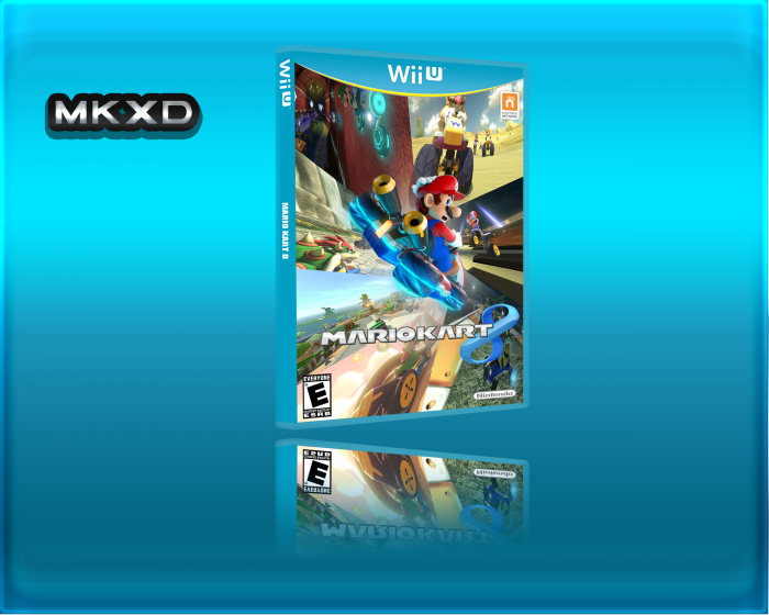
So that's a really nice idea for a mario kart 8 cover, I like the idea of having a track form the "8" of the logo.
Nontheless, there are a few things bothering me:
• The reflection is bad. If you can't do this, then scrap it, it's not important for the box itself.
• the pictures are stretched and out of proportion. You should work on that.
 Mario kart 8 Box Cover Comments
So that's a really nice idea for a mario kart 8 cover, I like the idea of having a track form the "8" of the logo.
Nontheless, there are a few things bothering me:
• The reflection is bad. If you can't do this, then scrap it, it's not important for the box itself.
• the pictures are stretched and out of proportion. You should work on that.
I would like to see you doing a back ;)
[ Reply ]
He didn't make the "8", it's the offical logo...
[ Reply ]