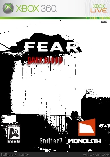
You are really good for a new user, the only problems I have are that the Dark Blood logo is kinda hard to read, and the AO logo is a little too far up and to the right.
1. The game woun't be rated AO
2. Make the tilte it more visible...very hard to read the "F.E.A.R. DARK BLOOD " part
3. Move the esrb rating up a little bit, it looks too low.
Not bad at all, one suggestion though, fix the subtitle (dark blood) I would suggest to not use a bevel and emboss for the reason that the text is too small to use the emboss, it makes it look blurry, and its kind of hard to read. 4/5

 F.E.A.R. DARK BLOOD Box Cover Comments
You are really good for a new user, the only problems I have are that the Dark Blood logo is kinda hard to read, and the AO logo is a little too far up and to the right.
What program are you using?
[ Reply ]
Oh almost forgot, 4.5/5
[ Reply ]
3/5
[ Reply ]
Great First try
1. The game woun't be rated AO
2. Make the tilte it more visible...very hard to read the "F.E.A.R. DARK BLOOD " part
3. Move the esrb rating up a little bit, it looks too low.
4/5
[ Reply ]
#1, I'm using photoshop.
[ Reply ]
It shows too.
The additions are great, easily a 5/5
[ Reply ]
Not bad at all, one suggestion though, fix the subtitle (dark blood) I would suggest to not use a bevel and emboss for the reason that the text is too small to use the emboss, it makes it look blurry, and its kind of hard to read. 4/5
[ Reply ]
almost forgot...M logo is to high and needs to be moved more to the corner, and the monolith logo should be moved a little more to the right corner.
[ Reply ]
#6, 5/5?! ARE YOU SERIOUS!?
[ Reply ]