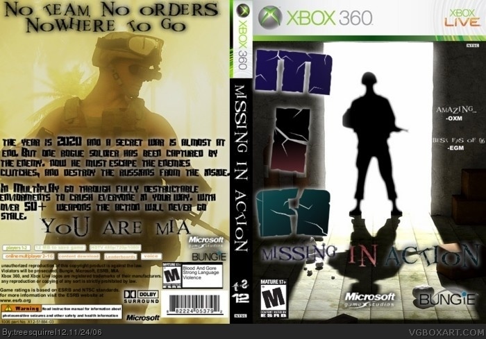
I decided not to do this in 3D. But i did make this game up (PLZ don't ask if i made it up later). its very hard to get screens for a game like this so i didn't put any on. I made the logo and put together the template by myself... well not much else to say except it took me a while to make
Bungies making a new FPS? AWESOME!! This is very good. The only thing I don't like is the MIA part of the front title. The colors seem too bright. If it's supposed to be USA colors or something, the A should be more blue. 4.5/5
#2, I so hope you are being sarcastic about this being a real game... anyway i worked real hard on the logo and they aren't supposed to be red, white, and blue but i will try to darken the M so they all kinda fit.
Wow that would be a kickass game especially if it was made by bungie you should be a game desighner or something.....4/5 because of the MIA on the logo.
Quiet a few problems really.
1) no pics on the back
2) the logo seems too colorful on a dark cover
3) a lot of things on the fron and back seem blurry.
3.5/5
sorry.
2 things i see wrong, if the year is 1920 why the is the guy on the back wearing tactical recon armour :P and second 'nowhere', in the context you are using it in is one word.
#9, well the guy on the back was very lighted and hard to see so i screwed around with the levels of it to darken it but i'll put the orginial pick and darken it using the light/dark meter and i'll sharpen up that logo
I really dislike the HUGE "MIA" logo, its really distracting, quotes on the front arent that good, and you need screens on the back...I know its hard to find screens for a made up game, but Ive made a few fake games and Im able to find something useful.EX. my Quarantine box has two screens from Resistence, but they are manipulated a bit to show some distinction. Another way to make screens is to get real life pictures and use filters to make them look cartoonish or otherwise gamelike.
 Missing In Action Box Cover Comments
I decided not to do this in 3D. But i did make this game up (PLZ don't ask if i made it up later). its very hard to get screens for a game like this so i didn't put any on. I made the logo and put together the template by myself... well not much else to say except it took me a while to make
[ Reply ]
Bungies making a new FPS? AWESOME!! This is very good. The only thing I don't like is the MIA part of the front title. The colors seem too bright. If it's supposed to be USA colors or something, the A should be more blue. 4.5/5
[ Reply ]
#2, I so hope you are being sarcastic about this being a real game... anyway i worked real hard on the logo and they aren't supposed to be red, white, and blue but i will try to darken the M so they all kinda fit.
[ Reply ]
Yeah, I was being sarcastic. And I love the shape of the logo and it's positioning, I just think it's too light.
[ Reply ]
Wow that would be a kickass game especially if it was made by bungie you should be a game desighner or something.....4/5 because of the MIA on the logo.
[ Reply ]
Quiet a few problems really.
1) no pics on the back
2) the logo seems too colorful on a dark cover
3) a lot of things on the fron and back seem blurry.
3.5/5
sorry.
[ Reply ]
2 things i see wrong, if the year is 1920 why the is the guy on the back wearing tactical recon armour :P and second 'nowhere', in the context you are using it in is one word.
[ Reply ]
#7, hmmmm good point i'll change the spelling error and the year, make the M a darker shade of blue
#6, what exactly is blurry???
[ Reply ]
#8, the text on the front is blurry, and the back picture seems smudged a little bit.
[ Reply ]
#9, well the guy on the back was very lighted and hard to see so i screwed around with the levels of it to darken it but i'll put the orginial pick and darken it using the light/dark meter and i'll sharpen up that logo
[ Reply ]
update
[ Reply ]
A lot better now with the logo. 5/5 because it had to be hard to get a made up game box together.
[ Reply ]
ok then.... which one of you yellow bellies rated this box a 1/5
>_>
<_<
i'm watching you
[ Reply ]
i just realized, this game's year takes place the same time as Perfect Dark Zero! 0_0
LAWSUIT!
[ Reply ]
did my 4 make up for it?
i think its a good idea, but it doesnt come together. the colors for the logo are wierd, and i dont like the quotes on the front.
[ Reply ]
I really dislike the HUGE "MIA" logo, its really distracting, quotes on the front arent that good, and you need screens on the back...I know its hard to find screens for a made up game, but Ive made a few fake games and Im able to find something useful.EX. my Quarantine box has two screens from Resistence, but they are manipulated a bit to show some distinction. Another way to make screens is to get real life pictures and use filters to make them look cartoonish or otherwise gamelike.
[ Reply ]
P.S. I also would suggest not to have Bungie as the Developer, you should use Infinity Ward or something...
[ Reply ]