
[ Box updated on November 10th, 2006 ] [ original ]
 Final Fantasy Tactics Advance Box Cover Comments
Comment on finalfantaseer22's Final Fantasy Tactics Advance Box Art / Cover.
[ Box updated on November 10th, 2006 ] [ original ]
Comment on finalfantaseer22's Final Fantasy Tactics Advance Box Art / Cover.
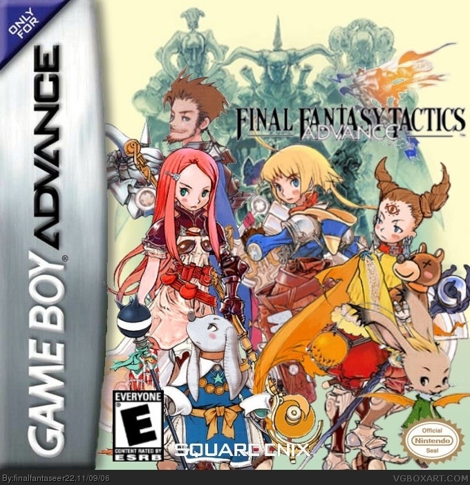
ahhhh what a wonderful jumble of madness.
[ Reply ]
Too cluttered, Square enix logo is hard to read as well as the final fantasy logo...2.5/5
[ Reply ]
awww its not that bad....
here i change square to black better?
your gonna tell me its too cluttered? of course it is that took layering skill.
oh w/e you have your reasons.
[ Reply ]
i think square enix looked better in white.
oh w/e it shows what i do for the community.
and did you look at it in full view? its a littel better.
[ Reply ]
Its just that with all the pictures you cant concentrate on one (focal point) and it really doesnt help explain what its about...tactics.
[ Reply ]
ok.
[ Reply ]
Ok...heres how you can fix it...Keep the Square Enix logo white but put a black stroke around it...Make logo bigger...take out some of the characters (probably would be best to just have main character)...add a background...and connect your picture with the game title (tactics)
[ Reply ]
not bad, not bad at all but the Squre enix logo sloud be white .
3.5/5
[ Reply ]
#8,
[ Reply ]
#8,
[ Reply ]
#8,
woops sorry for that.
anyways, my version 1 is in white, but #7 said that it sgould be black... but i disagree i think it is better white like you do.
[ Reply ]
updated?
any better yet?
[ Reply ]
#12 A lot better well done .
4.5/5
[ Reply ]
#13, thanks!
[ Reply ]
#12, It looks very nice.
I wish more people would take into account suggestions.
[ Reply ]
#15, i try...
plus i thought #7's first vote was unfair.
[ Reply ]
#16, Maybe he revoted, it is possible.
He should've.
[ Reply ]
#17,
well i dont mind. we kind of had an indirrect rumble on his resident evil 5 box... yeah i got kinda pissed off and i think he sucks at life.
but then again, im glad he finially gave me actual suggestion because i was able to fix it.
[ Reply ]
wow, thats very good, better than the real box art
[ Reply ]
#19, why thank you!
[ Reply ]
4/5
[ Reply ]