
Hey VGBA, Its been a long time since I post a box up but I found some time and I made this. Thank to everyone who helped out in the forums ( link ).
Credit:
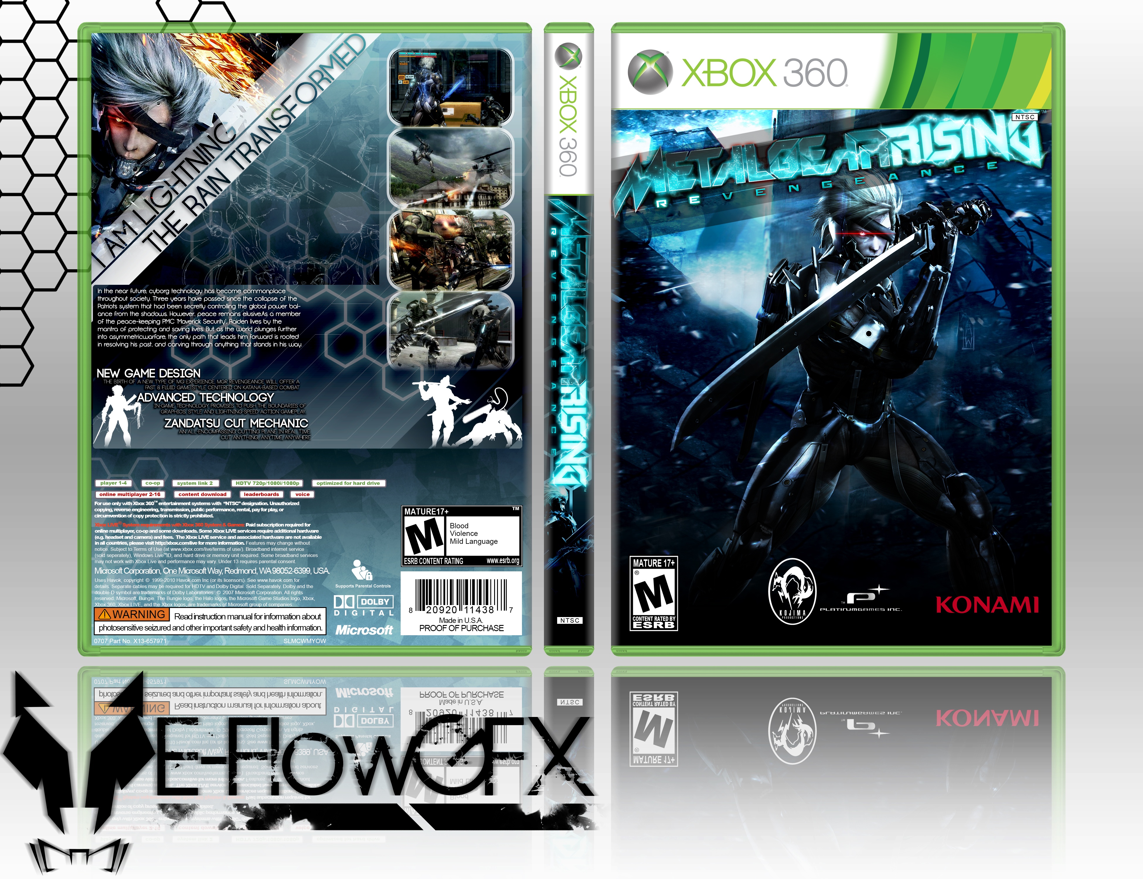
Template- Titan38
MGR Logo- CasvalDaikun
Renders- Eximmice
I worked real hard on this & hopefully this will be a restart for me & I'll be here more often. I kind of miss the VGBA community!
Enjoy! & PLEASE comment! :D
[ Box updated on April 8th, 2014 ] [ original ]
 Metal Gear Rising: Revengeance Box Cover Comments
Comment on E-FlowGFX's Metal Gear Rising: Revengeance Box Art / Cover.
Love it man!
[ Reply ]
Nice job! +Fav
[ Reply ]
I think I saw this in the WiP thread. It's a decent piece of work, if I say so myself. The empty triangle still bothers me, and I think that if the description text was there, the design would fare better, but it's not bad as it is.
[ Reply ]
I have an image of Raiden in that space that wasn't posted in the WIP thread.
[ Reply ]
everything is good except for the way you placed things. Mostly in the back, as Martiniii332 stated.
[ Reply ]
I was never too good at making backs. But I thank all of you guys for the criticism.
[ Reply ]
Update bump!!
View Fullscreen for updated box. For some reason it hasn't updated the preview yet.
[ Reply ]
I can see you've updated this and it looks a lot better than the original one you had. I especially like the way you handled the screencaps of the bosses on the back. My only gripe with it is the fact that the front and back look like they're not for the same box. If you can bring some of the brighter (almost cyan) blue to the back (maybe as the outlines for the screencaps?) it may tie in better. And I'm sure this happened when it was fitted to the box, but if you can somehow get some spacing to the left side so the text is not touching the edges, it would look a lot nicer.
I'm also not sure how I feel about that font for the headline. It sticks out like a sore thumb.
[ Reply ]
I'm set on that font. lmao
But I used your suggestions. Think I pulled it off?
[ Reply ]