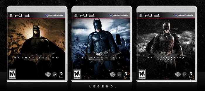
Batman looks a little choppy on the Batman Begins cover as well as the Dark Knight and looks low-res on The Dark Knight Rises. The right shoulder of the Bat on The Dark Knight Rises looks like it was shoddily cut and the background on The Dark Knight and The Dark Knight Rises also look low resolution.
The composition is nice and simple, but I personally find it too simple. Batman Begins is effective, but I feel like The Dark Knight and The Dark Knight Rises could use a little more; the only differences that make them look "unique" is a colour change, a city, and some sparks at the bottom.
I still like how they look, regardless of the errors; you've got a good concept and could really evolve on this... but that's just my opinion.
Not bad, but a few problems that I see:
1. TDKR logo is not consistent with the others and doesn't look great.
2. I don't understand why Batman is only slanted in TDK. Again, another consistently problem.
3. The renders are a bit choppy and TDKR render is very LQ.
4. Mostly what Arby Works said.
 The Dark Knight Trilogy Box Cover Comments
I don't see anything I don't like :D
[ Reply ]
Simple but effective.
[ Reply ]
Batman looks a little choppy on the Batman Begins cover as well as the Dark Knight and looks low-res on The Dark Knight Rises. The right shoulder of the Bat on The Dark Knight Rises looks like it was shoddily cut and the background on The Dark Knight and The Dark Knight Rises also look low resolution.
The composition is nice and simple, but I personally find it too simple. Batman Begins is effective, but I feel like The Dark Knight and The Dark Knight Rises could use a little more; the only differences that make them look "unique" is a colour change, a city, and some sparks at the bottom.
I still like how they look, regardless of the errors; you've got a good concept and could really evolve on this... but that's just my opinion.
[ Reply ]
Also: The bat logo in Batman Begins and The Dark Knight look low-resolution and choppy.
[ Reply ]
Not bad, but a few problems that I see:
1. TDKR logo is not consistent with the others and doesn't look great.
2. I don't understand why Batman is only slanted in TDK. Again, another consistently problem.
3. The renders are a bit choppy and TDKR render is very LQ.
4. Mostly what Arby Works said.
[ Reply ]