I've seen much worse, main problems is the front image is just screenshots put on top of each other, I get the geist of the idea, like GTA and 24, the bad image quality kills that potential though, the text is boringly presented on the back, but this does have originality and effort. 3/5 an average box.
The boxes style actually isn't bad, but the presentation reallly is lacking. I won't vote because i hate giving bad scores unless the person is mav_wolf, MK, stuff like that.
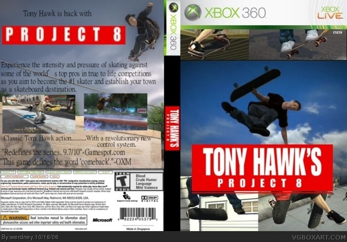
 Tony Hawk's Project 8 Box Cover Comments
This is my personal best. Credit to tothegame.com for the summary and thanks to ratchetcomand for critiquing.
[ Reply ]
The pic is kiddin burry but it still good.
4/5
[ Reply ]
in my personal opinion, 4 is waaaaay to generous. the back isn't that bad, but the front is very, very sad.
2.5/5
[ Reply ]
3/5 becuase im in a good mood today but the fornt could have been beter .
[ Reply ]
What should I do to improve the front? I worked for 5 hours on this, and I thought it was good......:(
[ Reply ]
Nevermind. I just give up.
[ Reply ]
#6 Don't give up , The fornt is burry and kiddin borning . Get a diffent pic and fix the burry suff .
[ Reply ]
I've seen much worse, main problems is the front image is just screenshots put on top of each other, I get the geist of the idea, like GTA and 24, the bad image quality kills that potential though, the text is boringly presented on the back, but this does have originality and effort. 3/5 an average box.
[ Reply ]
The boxes style actually isn't bad, but the presentation reallly is lacking. I won't vote because i hate giving bad scores unless the person is mav_wolf, MK, stuff like that.
[ Reply ]
world's best? that makes it world is best so yeah get gimp
[ Reply ]