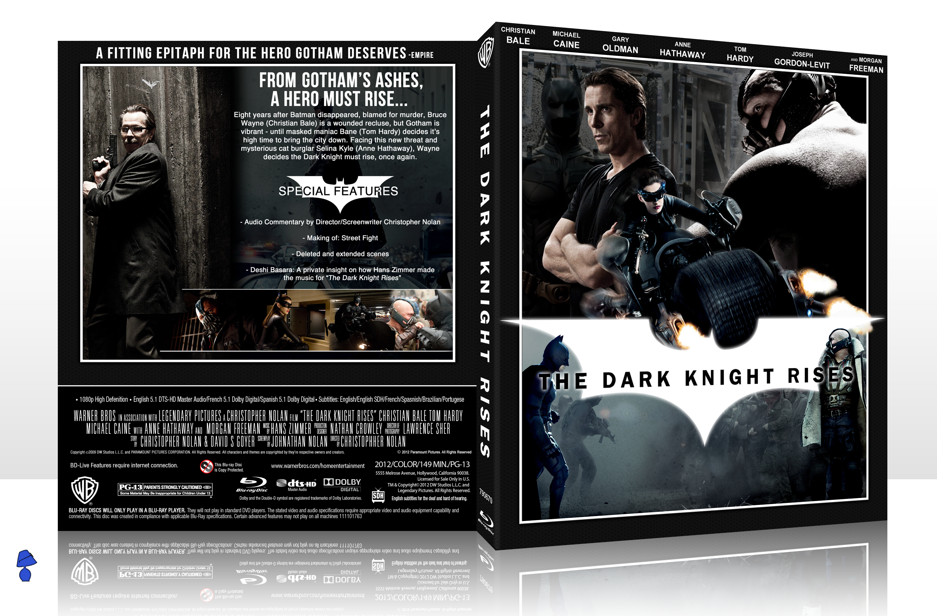
Never actually done a movie box before, always wanted to but never actually tried until now. Pretty happy with the outcome.
[ Box updated on August 29th, 2012 ] [ original ]
 The Dark Knight Rises Box Cover Comments
Comment on AgentLampshade's The Dark Knight Rises Box Art / Cover.
It's nice, great job.
[ Reply ]
I think the lower part of the front would look better imo. if there was a more fitting image that flows better with the upper half (in terms of the overall dark contrast of the box) also the main title doesn't feel right to me, I think it's the way it overlaps Bane and Bruce. I think it would look better, if the word 'RISES' is centered below 'THE DARK KNIGHT' (to fill up the white Batman logo and to get rid of the overlapping on the characters) other than this, it looks really good. I especially, like the back layout, great job ;)
[ Reply ]
Cheers for that, I've updated it with your suggestions.
[ Reply ]
@AgentLampshade much better ;)
[ Reply ]
Very Nice .
[ Reply ]
The front seems very muddled to me, I'm not a fan of the composition. I also find the back too plain.
[ Reply ]