![]() »
»
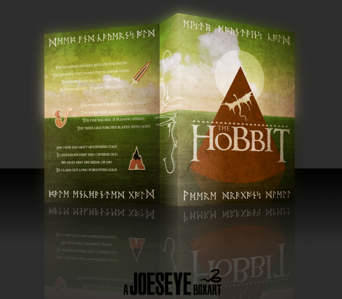
I wasn't sure whether to upload this one as a movie or book box art. Anyway, I was inspired to make this after recently re-reading the book and becoming psyched for the film. I produced most of the art myself.
Thanks for viewing. Critique welcome as usual ;).
 The Hobbit Cover Comments
Comment on Joeseye's The Hobbit Cover.
Beautiful work!
[ Reply ]
This left me near-speechless. Flawless work.
[ Reply ]
This is amazing.
[ Reply ]
Man, I love it!
[ Reply ]
Awesome , It Really Fit With Book Boxart o__O
[ Reply ]
Creative!
[ Reply ]
Great Work
[ Reply ]
very nice :)
[ Reply ]
Nicely done!
[ Reply ]
Very nice artwork and colors, you've got such a unique style, which I think is amazing and by only looking at the thumbnail, I know it's a box from you.
I'd only suggest to make the upper half of the text on the back, orange/brown or green, as it could improve the visibility of the text? I think you should at least give it a try ;) (because to me, the white text on the green stands out way more)
[ Reply ]
Thanks for your feedback! I just attempted a little mock-up with dark green text on the back, like you suggested - it doesn't quite look right. I think it's because it detracts from the consistency of the overall box and white/beige text theme? For example, the moon on the front and the text on the back. I see what you're getting at though - the back on it's own looks better. In future I'll keep text clarity in mind, I tend to sacrifice it for colour consistency and composition.
[ Reply ]
:p
[ Reply ]
Really clean design, looks awesome :)
[ Reply ]
Got yourself a double hof :)
[ Reply ]
Wow, 2 HoFs in a row. Great work!
[ Reply ]
Congrats Joe!
[ Reply ]
Wow! Thanks a lot guys, getting two Hall of Fame's in a row brought back the feeling of getting my first box into the Hall.
*Raises goblet*
Cheers!
[ Reply ]
So much yes
[ Reply ]
First, I was unimpressed. But then I took a second look at it, and realized how simplicity just kills. I dunno how you came up with this idea, but I like this a lot. Great job dood!
...
Begging for a printable :)
[ Reply ]