![]() »
»

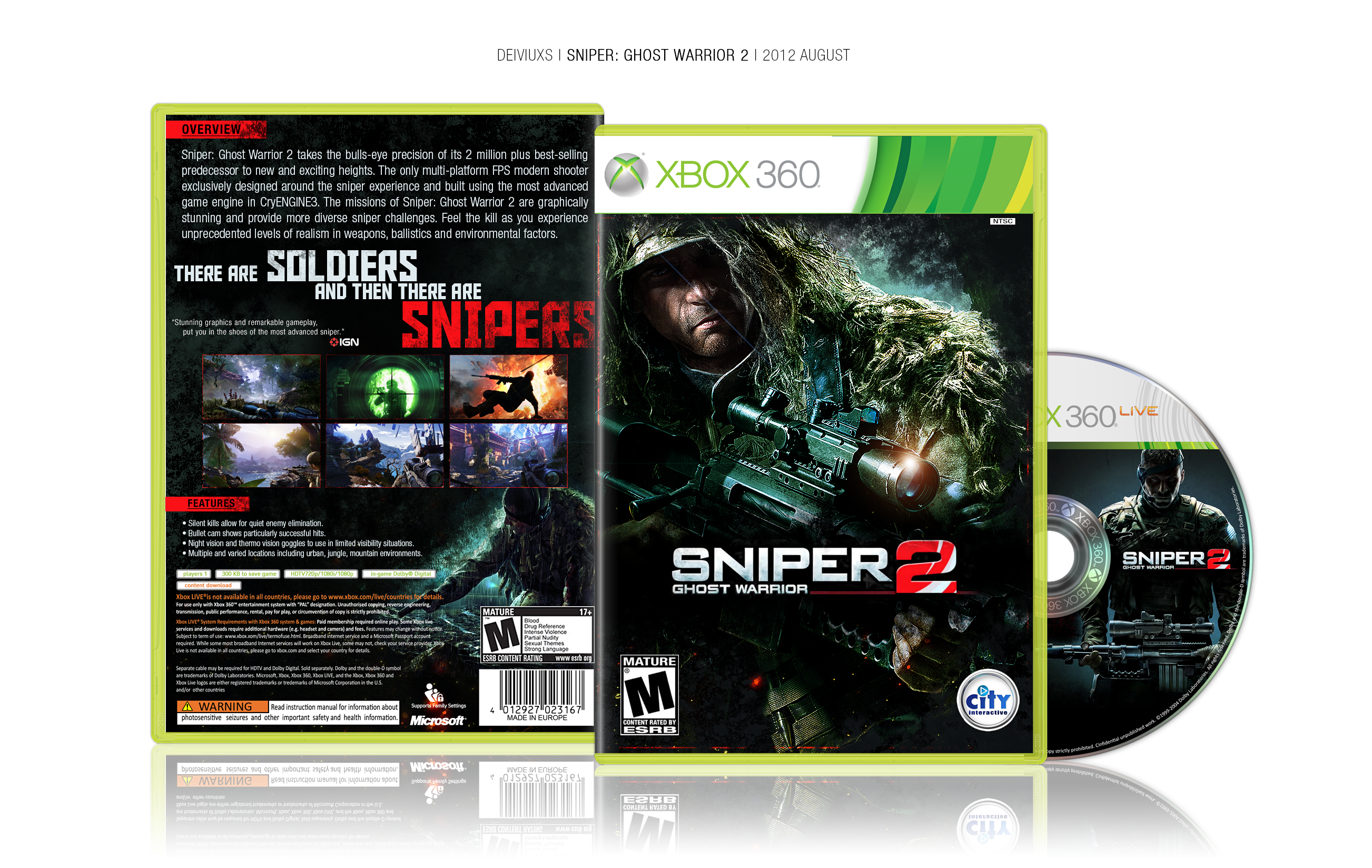
Custom "Sniper Ghost Warrior 2" box art created in Photoshop CS6.
Comments & favorites are welcome.
View full size for best quality & detail.
(c) designs by deiviuxs
[ Box updated on August 26th, 2012 ] [ original ]
 Sniper Ghost Warrior 2 Box Cover Comments
Comment on deiviuxs's Sniper Ghost Warrior 2 Box Art / Cover.
This is realy nice. Perfect...
[ Reply ]
That's very good.
[ Reply ]
There's little if anything of true relevance I can suggest you improve upon. The back typography, specifically the synopsis, is somewhat flat and bland in appearance, but otherwise this is a very effective design. Nice work.
[ Reply ]
Perfect Work....
Congratulations
[ Reply ]
nice Guys
[ Reply ]
I just realized, the red line behing "features" is slightly over the template.
[ Reply ]
The general design is really nice and well done, the only thing that bugs me is the synopsis on the back. As Pleiades said, it looks flat and bland.
[ Reply ]
Thanks for the comments guys. Few have mentioned that description text did not match. Well, the cover has been updated with new fonts on the back. Hope this looks better now. :)
[ Reply ]
This is highly underrated. It's a shame.
[ Reply ]
So many views, so little anything else.
[ Reply ]
Much better now. Favorited.
[ Reply ]
I like the front, but dislike the simplicity of the back's layout, which doesn't match this game at all, specially the synopsis of the game, which should be in a smaller font. I also dislike the fact that you left so much free space around (Above, and bellow the synopsis, to the right of the features), makes the box feel empty and incomplete. Nothing wrong with the screenshots, but I think it would've been a nice touch if you let the soldier's head above them, instead of behind them.
Nice job, but I think you could've done better.
[ Reply ]
Great work with the front, especially editing the original artwork. However, I must resonate other's comments about the back layout - seems quite simple and one-dimensional to me. I know if you took a risk and tried something new it would pay off in spades because you ARE a fantastic artist :)
[ Reply ]
I think the back could use a little rearranging with the text and stuff, but still really great job.
[ Reply ]
Oh man this is hawt. If there was one thing I might change is the screenshot layout. A little simple for my tastes. But I mean that's it cuz this is overall awesome.
[ Reply ]
I really like the back of the cover.. very clean layout I might say.
[ Reply ]
The front is just totally awesome and the back looks cool as well, though I'm not too big of a fan on how the screenshots are put on there..
[ Reply ]
The front is spot on dude, looks extremely official. The back isn't too shabby either. Great job dude =)
[ Reply ]
I liked it, looks like more a common movie cover than a game but still good
[ Reply ]
nice 1
[ Reply ]
Pretty awesome, now make something else.
[ Reply ]
It seems that I have faved this already. I love it. It has a nice, clean, official look. As Pleiades said, I think that the typography on the back can be arranged, but otherwise, splendid.
[ Reply ]
Pretty solid.
[ Reply ]
Great job!
[ Reply ]