You should post your box here first: link
People will give you feedback, and it will help you become a better artist. Don't post this one, since it's already on the site, but try that next time.
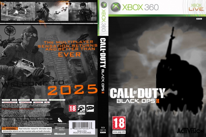
Back to the box. I like the idea on the front, the problem is that everything is low quality, and the grass is poorly rendered. You also need to work on logo placement. For the back, never put dark text on a dark image. You need text to stand out, so the viewer can read it easily. What I'm saying is change the black text to white. Overtime you'll get to know this stuff. Also, what program do you use?
 Call Of Duty Black Ops 2 Box Cover Comments
Nice Guys . I love the cover design is fine, but some of his posts big flip. If you follow your plan all your posts interesting
[ Reply ]
You should post your box here first:
link
People will give you feedback, and it will help you become a better artist. Don't post this one, since it's already on the site, but try that next time.
Back to the box. I like the idea on the front, the problem is that everything is low quality, and the grass is poorly rendered. You also need to work on logo placement. For the back, never put dark text on a dark image. You need text to stand out, so the viewer can read it easily. What I'm saying is change the black text to white. Overtime you'll get to know this stuff. Also, what program do you use?
[ Reply ]
thanks for feedback and i use photoshop
[ Reply ]