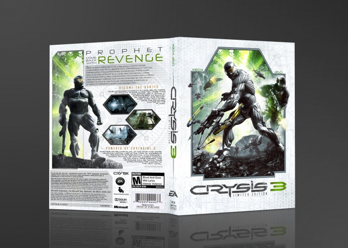
Green can be such an effective color; it's a shame it's not used more often in designs. Obviously, this is a clear example of it used properly. It's the primary theme yet used in moderation; it's not overpowering and works well with the white/black.
The layout too is well thought out. In fact my only complaints lie with the typography. The back text (especially that surrounding the screenshots) could use some breathing room, and the Xbox 360 text on the front seems unnecessary for a limited edition that doesn't conform to EA's usual LE look to begin with.
Regardless, the positives outweigh any negatives. Nice work.
I agree with the others about the Xbox360 logo, it's too small and isn't in need for a change imo. because there is enough blank space in the corners and it just doesn't look that great, to be honest :/
Everything else is just perfect, I love the colors, effects and layout ;)
I don't say this often other than artists like drakxxx and spike. This is absolutely amazing. The colours, layout, spacing, just everything. Done to perfection.
 Crysis 3 Limited Edition Box Cover Comments
Outstandingly beautiful.
You've outdone yourself.
[ Reply ]
Amazing. :D
[ Reply ]
Wow, thanks guys! Means alot. Its always great when people enjoy something you acutally put alot of effort in.
[ Reply ]
Love the design, especially on the back.
[ Reply ]
Wow! This is great!
[ Reply ]
Spectacular!
[ Reply ]
I like everything but the placement of XBOX 360.
[ Reply ]
me 2
[ Reply ]
Amazing, I like it...
[ Reply ]
Wonderful work!
[ Reply ]
It looks great, but there should be some sort of explanation on the back with what's in the limited edition.
[ Reply ]
Green can be such an effective color; it's a shame it's not used more often in designs. Obviously, this is a clear example of it used properly. It's the primary theme yet used in moderation; it's not overpowering and works well with the white/black.
The layout too is well thought out. In fact my only complaints lie with the typography. The back text (especially that surrounding the screenshots) could use some breathing room, and the Xbox 360 text on the front seems unnecessary for a limited edition that doesn't conform to EA's usual LE look to begin with.
Regardless, the positives outweigh any negatives. Nice work.
[ Reply ]
I agree with the others about the Xbox360 logo, it's too small and isn't in need for a change imo. because there is enough blank space in the corners and it just doesn't look that great, to be honest :/
Everything else is just perfect, I love the colors, effects and layout ;)
[ Reply ]
I don't say this often other than artists like drakxxx and spike. This is absolutely amazing. The colours, layout, spacing, just everything. Done to perfection.
Keep up the good work.
[ Reply ]
Thanks so much guys!
[ Reply ]
I love how classic this feels. They don't make boxes like they used to...
really lovely work.
[ Reply ]
Congrats!
[ Reply ]
Beautiful
[ Reply ]
Beautiful, absolutely beautiful
[ Reply ]
Congrats with another well deserved HOF ;)
[ Reply ]
blew me away.....STUNNING bud!
[ Reply ]
exelente dedicacion. 0.º pero no me gusta que no compartas tu cover
[ Reply ]
would you please add the printable ?
[ Reply ]