Well, my first box in just under 2 years. Brings back some memories. Hopefully you guys/girls like it.
 The Elder Scrolls Online Box Cover Comments
Comment on GrahamZ's The Elder Scrolls Online Box Art / Cover.
Nice job.
[ Reply ]
Cool...
[ Reply ]
Wow. I just love this.
[ Reply ]
Nice To See You Again , Amazing Return , o__O
[ Reply ]
Thank you :)
[ Reply ]
Needs more comments, it's very professional indeed. Love that front.
[ Reply ]
I agree, box is nice and need more views. GJ dood :)
[ Reply ]
@GameScanner.org Thanks guys, Most of the users i know are now long gone, not much new member who me :(
[ Reply ]
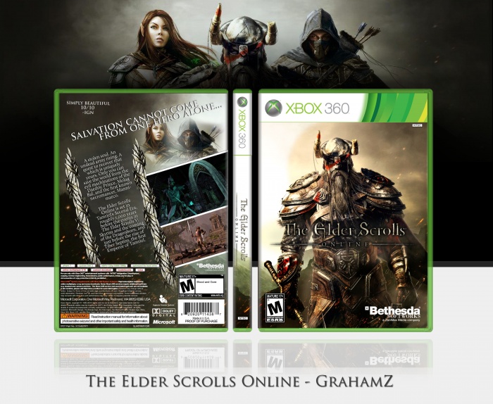
The front works as is. I don't have anything negative to say; it's a simple and effective way to demonstrate what I'd expect from the game. In reality I wouldn't be surprised if the official cover goes with the same motif as previous Elder Scrolls games.
My issue with this cover is primarily with the slant on the back. Considering the elements you have in place, especially the otherwise neatly arranged and organized text, the slant seems like an unnecessary attempt to add visual uniqueness to a design that would have been fine horizontally aligned. It's more noticeable still when you see things like the characters and IGN quote straightened. The two angles clash with each other.
Personally, I think if you were to realign the back, it'd look much better.
[ Reply ]
You're right it was just to try add visual uniqueness, It was a 50/50 chance it would work, maybe didn't work in this case.
[ Reply ]
Nice Box...
[ Reply ]
Pretty good.
[ Reply ]
I love this, but just to be picky I have to say that I think that the "Bethesda" logo n th bottom right is far too big.
[ Reply ]
*in the
[ Reply ]
@Mtp Will keep that in mind.
[ Reply ]
NICE! I cant wait for this game to come out!
[ Reply ]