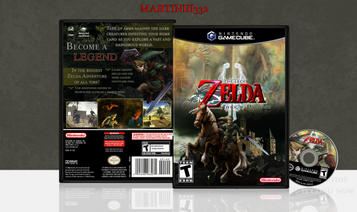
[ Box updated on August 7th, 2012 ] [ original ]
 The Legend of Zelda: Twilight Princess Box Cover Comments
Comment on Martiniii332's The Legend of Zelda: Twilight Princess Box Art / Cover.

No offense, but this is kind of lazy. How do you go from Persona 4 to this? It's just text on a background and renders. Sorry if I'm coming off as rude, but you've made much better boxes.
[ Reply ]
I understand if you may think so, but it actually took more time blending stuff together to make this than it may look. There were layers upon layers to make the background that I have.
[ Reply ]
@Martiniii332 Oops I was talking about the slip cover lol but it is kind of ugly.... The box is awesome though!
[ Reply ]
@TheNiceGuy damn it nice guy. Yeah I know looking at it now, it's pretty ugly. I don't want it here anymore. I was working on it late at night, so I was probably delusional :P
[ Reply ]
I tend to think, that this box is way too good to be a repro :P In fact looks like the official one :)
I'm sure you've put in a lot of work into it. 4/5 & fave. Keep them comin' my friend.
[ Reply ]
@GameScanner.org Haha thanks!
[ Reply ]
Hey guys, so here's a new one from me, tell me what you think :D err, don't look at the original. I don't like it so just this one is important lol.
[ Reply ]
I'm sorry to say that but it doesn't work at all. It's way too dark, the renders are low quality, they doesn't seem to belong to the front art. You really have to work on how to integrate properly a render into a new background.
One more thing, you should stop using the Zelda Font, it's nice to make a custom logo with it but not an entire text, neither a punch line.
[ Reply ]
Best quality is what you see. I wanted to give off a darker feel to this one instead of the generic "Zelda" interpretation. Eh, I suppose I agree with the font thing, and I made sure not to include it in the description text, but I felt this time that it would go.
[ Reply ]
@Martiniii332 best quality? You used the Midona render you asked for in the WIP section right? Why didn't you use that one instead :
link
THAT is best quality, in order to make a good box you have to spend more time looking for the best stuff.
[ Reply ]
@CasvalDaikun That is what I used? I spent probably over an hour in total searching for high quality renders, and unfortunately those are the best I got. Especially the Link one, I don't know if you are capable of pulling one out of a hat, but I was not.
[ Reply ]
This isn't one of you're best, thats for sure. But i guess some days are better than other. I think the back would be beyond awesome if you would have brightened it a little, the front too. and the disc art is awesome, but the disc looks like some sticker placed on the floor xD I say if you would have put in 30 extra minutes of work, this would be spectacular.
[ Reply ]
You know what? I am going to update it and make it brighter since everyone keeps saying that it is too dark.
[ Reply ]
@Martiniii332 Thats good! :) it's good to consider peoples suggestions. remember, these are our opinions, so don't forget what that it's your box, and you do as you please! :D
[ Reply ]
I have to disagree with everyone else, this is top notch!
[ Reply ]
Thanks bro.
[ Reply ]
I really don't understand what is up with all these peeps eyes, but honestly this box looks amazing man! Better than the original to be honest. :) Seriously, if you enjoy the work you've done don't let these downers get you down. :P
[ Reply ]
Eh. I mean I know my work is not the best, but I feel I did work on this one. Thank you.
[ Reply ]
@Martiniii332 NO! Don't get down on yourself! >:(
In this topic I've seen this called ugly, lazy and not your best and honestly I've yet to see much in the way of good advice at all. Example: It's too dark. Really? How so? This box art is amazing and don't let anyone tell you otherwise! :D
[ Reply ]
@TruePhilosopher Thanks. It's mostly the site really, I do not have much motivation and stuff, so.
[ Reply ]
Yeah, I do really like this box.
The site has been losing steam recently. It seems like we had a huge surge in popularity back in early 2012, but now it's back to late 2011 standards. (sigh)
I'm honestly missing the Trolls.
(gasp!)
[ Reply ]
@willo10 Yeah exactly. Everyone is getting pissed at each other and leaving :/ but glad you like the box!
[ Reply ]
@Martiniii332 I'm honestly surprised most of these members are still here. You'd think they'd get fed up with most of this.
Well, at least one day we might be considered the elite.
One can only dream.
[ Reply ]
@willo10 Yes I agree, if I was in any of their positions, I might have. But you know, I am glad they didn't.
Being an elite would be awesome.
[ Reply ]