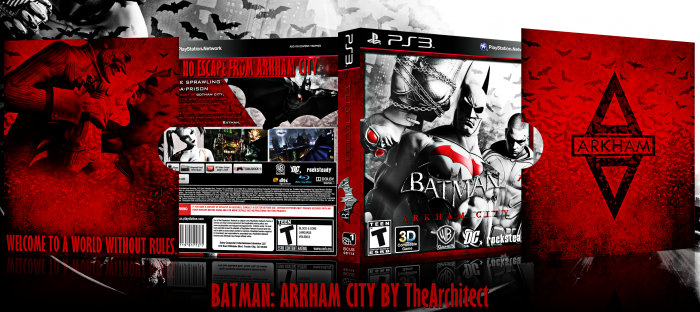
After a long period of time, I have created a cover, and it's for one of the best action games out there, Batman: Arkham City. I want to give credit to Bastart for the Batman render on the back, Scorpion Soldier for the template and everyone who helped in my WiP thread.
Thanks for viewing!
 Batman: Arkham City Box Cover Comments
Comment on TheArchitect's Batman: Arkham City Box Art / Cover.
Wow. You definitely made this into such an awesome box art. Fantastic.
[ Reply ]
Thanks, that means alot to me!
[ Reply ]
This is Really Awesome , Nicer Than that is the Red Bat logo On batmans Chest . o___o
[ Reply ]
Was watching this progress on the forums. Turned out great.
[ Reply ]
Great...
[ Reply ]
Nice one! I especially like the slipcover and layout on the back of the box.
I've got some minor issues with the actual box though :/ The front Logo is too close to the logos beneath it (I think you should move it up a bit or make the logos smaller) Catwoman's ears of her mask, are suddenly cut off? it doesn't look very good imo. try make the ears transist onto the spine.
As for the back and spine, The 'Arkham City' part of the logo on the spine, is kinda clashing with the red texture underneath it and the same issue goes with the red text of the synopsis on the back (I'd suggest to make it the same red as the tagline)
[ Reply ]
Ill try doing that, thanks for the tips!
[ Reply ]
the best batman arkhan city cover i ever seen!
[ Reply ]
I love the slipcover, but I got a minor issue with the box itself. And it's minor. Why does Catwoman and Robin go over the red line on the front, while Batman does not? It just doesn't feel right. Otherwise a very good box. Good job! :)
[ Reply ]
It just didnt look good, and thanks!
[ Reply ]
The only problem is that the text is hard to see on the back. Well done though!
[ Reply ]
wow, this is fantastic! though the image is confusing me a little
[ Reply ]
How is it confusing you?
[ Reply ]