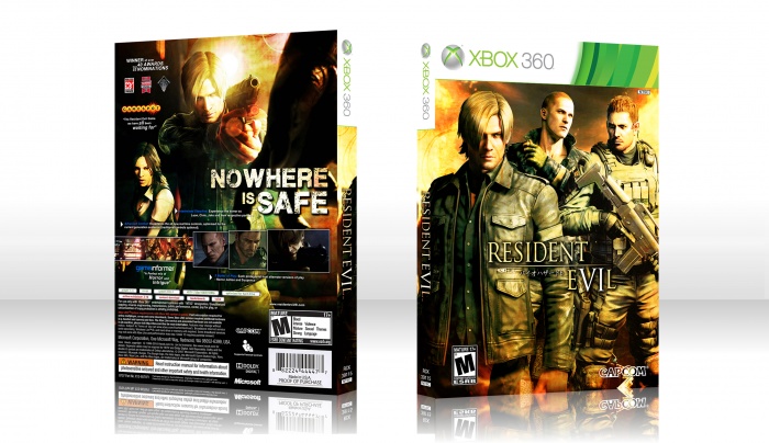
Really wanted to do something new compared to the traditional design and pallet for a Resident Evil box. The logo purposely doesn’t have a '6' but instead represented as 'VI' (in EVIL), roman numerals. The VI is larger than the rest of the text in the logo and whole white as it can stand out and identify the 6 instalment in the Resident Evil franchise.
Hope my brief description explained the logo if it cannot be identified at first sight. Enjoy!
 Resident Evil 6 Box Cover Comments
Comment on BacKin5Minutes's Resident Evil 6 Box Art / Cover.
Awesome! The lighting and colors are wonderful. The only thing I can suggest is making the "VI" some other color like purple or red.
[ Reply ]
Thanks. I tried many alternate colour tones and hues, but each clashed with the golden theme of the box. So I decided to stick with the consistency but explain my reasons in the description of the box.
[ Reply ]
I LOVE the logo idea.
[ Reply ]
me too :) it's a six that's for sure, but it isn't distinctively enough like already mentioned above though. I'd suggest to make it a tad bigger.
[ Reply ]
Damn, this looks great.
[ Reply ]
Nice. But you made Jake pretty tall on the front, don't ya think?
[ Reply ]
VI : 6 , Nice Idea .
[ Reply ]
Very nice cover and creative idea!
[ Reply ]
Awesome...
[ Reply ]
I cannot see the logo at all; anyone tell me where it is?
[ Reply ]
Are you serious? If so it is in the centre of the front, very hard to miss.
[ Reply ]
@BacKin5Minutes I see. I thought that was just a design choice for the VI in evil. It is not very clear you see...
[ Reply ]
My problem is with the logo, it's clever but it isn't obvious enough for people to recognize it. It doesn't help that the color of the logo is a yellow/white gradient and the "number" is white, it blends in too much and it isn't big enough to be differentiated as a numbered logo.
[ Reply ]
To be honest i agree with all of you about the logo and will soon fix it :)
[ Reply ]
WOW THAT'S COOL
[ Reply ]
Screw the logo, it's still awesome! The official logo would destroy the essence of it
[ Reply ]
WTF!! Very Nice
[ Reply ]
hey mate awesome. would you please add the printable?
[ Reply ]
I'm fairly confident Capcom stole this idea
[ Reply ]