![]() »
»
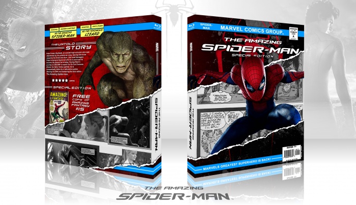
Really wanted to do somthing unique compared to the recent Spider-man boxes, hope i achieved this and that it is able to stand alone from the norm. Enjoy. Design was a tribute to the classic Amazing Spider-man comics.
[ Box updated on July 2nd, 2012 ] [ original ]
 The Amazing Spider-Man Box Cover Comments
Comment on BacKin5Minutes's The Amazing Spider-Man Box Art / Cover.
UPDATE: Fixed skew of spine.
[ Reply ]
This is damn good. I know comic book movie covers looking like comics isn't anything new, but I still think you pulled off a very original design. Great use of the concept.
[ Reply ]
Man, this is awesome.
[ Reply ]
Nice. I'm going to see this tonight.
[ Reply ]
Damn. Seeing it tomorrow lol
[ Reply ]
This is End .
[ Reply ]
Amazing box!
[ Reply ]
Thanks everyone
[ Reply ]
Wow ! It's really a great job !
[ Reply ]
Marvelous ;) I have never seen the render of Spider-Man you've used on the front before, you made it yourself?
[ Reply ]
Yer I rendered it from this. link
[ Reply ]
@BacKin5Minutes Nice job on the render and thanks for the link ;) although it isn't that great in terms of quality, I really like that pose of Spider-Man.
[ Reply ]
@Bastart Yer that was my only worry. Although, as you mentioned I liked the image soo much had to add it, and I believe it is the best Spidey stance to fit my design.
[ Reply ]
Really creative and professional, Good job man!
[ Reply ]
This is amazing!
I like it how you made the crushed paper!
[ Reply ]
Great comic book energy. I love the front.
[ Reply ]
that is awesome
[ Reply ]
Like the movie title... AMAZING. :D It's really awesome and you pulled that comic look off real nicely. It's a great diesng and Spider-Man coming out of the comic is a god approach. I think it's very creative and crafty.
Only thing I'd have to criticise is that on the spine, the logo is black & white. Although that would maybe be a personal opinion and a matter of taste.
[ Reply ]
What do you mean about the spine? Sorry but I don't fully understand.
[ Reply ]
@BacKin5Minutes
The spine is the "side" of the cover. Not the front, not the back, the side aka "the spine". :)
[ Reply ]
@XBU Philippe I know what the spine is. I mean what are your dislikes/ what do you believe should be altered.
[ Reply ]
@BacKin5Minutes
I simply don't like that the logo of "The Amazing Spider-Man" on the back is in black and white and I personally would have prefered a colour logo. ;)
[ Reply ]
@XBU Philippe But I wanted to follow the black and white theme of the comic stip as it represent traditional form of entertainment. If I make the logo on the spine a different colour it effects the overall design of the drastic differences from comics and movies.
[ Reply ]
Congrats. Its well deserved.
[ Reply ]
Congrats on HOF! I love the comic book feel to it.
[ Reply ]
Wow that was fast thanks everyone!
[ Reply ]
oh man...its perfect, printable
[ Reply ]
Nice. I think it’s very refreshing to see a collaborated deign between the film + comic book.
The concept is really working well.
Fav.
[ Reply ]
I love this box, but the the "Staring..." on the back is annoying me so much for some reason
[ Reply ]
great! I love how you crossed the movie with the comics!!! and the back is outstanding!!! 10/10
[ Reply ]
This Is Really Nice Friend . . . I Like It Your Jobs . . . (â—Žoâ—Ž)
[ Reply ]
CRAZY GOOD DESIGN
[ Reply ]
ohhh great cover
[ Reply ]