Very nice one!
I like it how you you put on the renders.
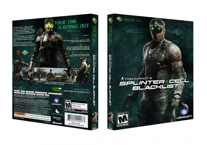
But maybe you could use some shadows on the renders.
Its nice how you used a head on the spine.
whole box is great but i think there is some prob!
character in front need some color balance imo. see, if Sam in front and back has same color scheme and contrast of course, it will be More eye-catching.
and the line under Gameinformer has a wrong word: Best series....
anyway khaste nabashi bro!
The front looks really nice, but as mentioned before, Sam could use a bit more contrast to make it pop. The ESRB logo looks like there fell something on top of it and made it look really squeezed :/ I'd suggest to make the Ubisoft logo a bit smaller, so it's less sticking to the knife he's holding (it kinda bugs me somehow, the way it looks right now)
I like the layout on the back, but there are some minor issues which could be improved imo. I'd make the main render (or the text) a bit smaller, so it gets more breathing space in between them. I'd suggest moving the accolades next to the gamepsy logo and move the ubisoft and splintercell websites to the space right underneath the synopsis.
 Tom Clancy's Splinter Cell Blacklist Box Cover Comments
Very nice one!
I like it how you you put on the renders.
But maybe you could use some shadows on the renders.
Its nice how you used a head on the spine.
[ Reply ]
the back cover is awesome
[ Reply ]
Very Nice zalay...
[ Reply ]
This is Amazing , But 1 question : is the background official for the game ?
[ Reply ]
thanx, is the piece of screenshot...
[ Reply ]
Thanks for answer .
[ Reply ]
really awesome...
[ Reply ]
whole box is great but i think there is some prob!
character in front need some color balance imo. see, if Sam in front and back has same color scheme and contrast of course, it will be More eye-catching.
and the line under Gameinformer has a wrong word: Best series....
anyway khaste nabashi bro!
[ Reply ]
The front looks really nice, but as mentioned before, Sam could use a bit more contrast to make it pop. The ESRB logo looks like there fell something on top of it and made it look really squeezed :/ I'd suggest to make the Ubisoft logo a bit smaller, so it's less sticking to the knife he's holding (it kinda bugs me somehow, the way it looks right now)
I like the layout on the back, but there are some minor issues which could be improved imo. I'd make the main render (or the text) a bit smaller, so it gets more breathing space in between them. I'd suggest moving the accolades next to the gamepsy logo and move the ubisoft and splintercell websites to the space right underneath the synopsis.
[ Reply ]
thanx, i will fix it...
[ Reply ]
WOW Man, You did a great job!
[ Reply ]
Good job! I love it!
[ Reply ]
Incredible! :D
[ Reply ]
Awesome Cover!!!! typo... Sneak* not snea;.
[ Reply ]
Everything looks stretched horizontally.
[ Reply ]
Everything? i don't think so,
(maybe, it's for the template...)
[ Reply ]
Printable Added!!
[ Reply ]
Wowww..., Very nice man.
[ Reply ]
Check Your E-Mail , Tell Me Your Idea .
[ Reply ]
Really nice. Default I had requested. If possible, it also gives, for pc
[ Reply ]
Congrats Zalay, I'm Happy For This . . .
[ Reply ]
Thank you bro.
[ Reply ]
good work.
[ Reply ]
TOP Design
[ Reply ]