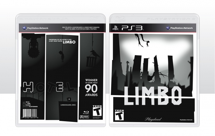
I recently started looking at a lot of Saul Bass' film posters from the 50's and became intrigued by the shapes that he used on those posters and decided that I wanted to find a way to apply them to one of my designs. Well, this is it. A combination of influences from the Saul Bass' shapes to the look and feel of the game. But, what I really like about these shapes is that it almost appears as puzzle pieces the player has to figure out how to put together.
 Limbo Box Cover Comments
Comment on Ayden's Limbo Box Art / Cover.

Nice! I especially like how you maintained the legal info without breaking the design.
[ Reply ]
Thanks. The way this was setup actually allowed me to use it as a grid, making information placement much easier.
[ Reply ]
@Ayden I feel like the logo would be better placed inside it's own box, like this: link
[ Reply ]
This needs more attention, it's very good, sleek design and despite being simple it doesn't feel empty.
[ Reply ]
Thanks, much appreciated.
[ Reply ]
Very nice. I just don't like that white line going behind the logo.
[ Reply ]
Very much Saul Bass style w/ a late 60's vibe. This is great work.
[ Reply ]
Thanks.
[ Reply ]
A little simple , But Amazing .
[ Reply ]
Thanks, I was always taught "simple design is good design."
[ Reply ]
Why there aren't disc based versions of such games just amazes me
[ Reply ]
Nice one!
[ Reply ]
Thanks.
[ Reply ]
Yeah, Saul Bass work is great. The concept and layout worked out really nice on this box, nice job ;)
[ Reply ]
Thanks and yeah I completely agree, Saul Bass is amazing.
[ Reply ]
Great job on making an original LIMBO box. Most of them are the same but this one really stands out. Once again, excellent work. :D
[ Reply ]
Thanks. I did a lot of research to figure out a way to make it unique.
[ Reply ]
Quite simple, but yet effective cover! A very good design for a very good game (+fav!)
[ Reply ]