![]() »
»
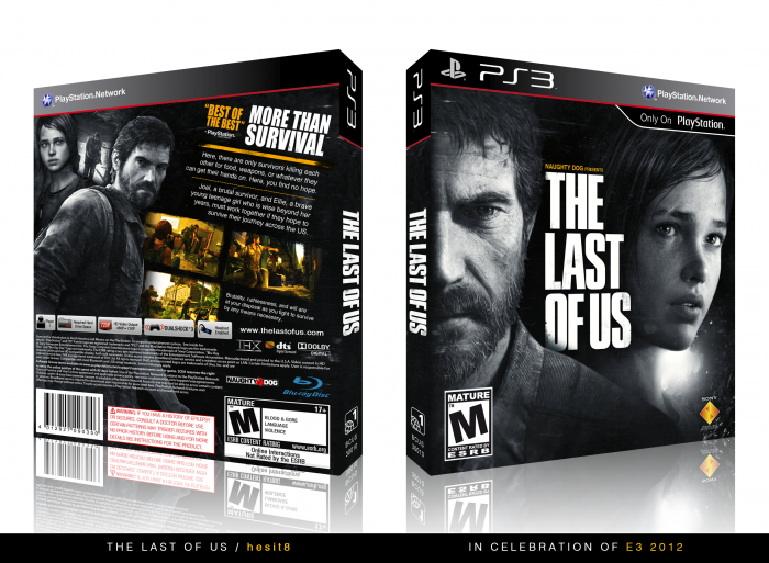
A game I'm looking forward to from a developer I adore. Wanted to do something different and the art I found for the cover fit the bill rather nicely. Enjoy!
Special thanks to those who gave feedback in the WIP forum, much appreciated!
Note: Definitely check out the printable, much better quality (also, back layout is un-slanted).
 The Last of Us Box Cover Comments
Comment on hesit8's The Last of Us Box Art / Cover.
Damn, I was going to make a box with the same concept. Looks great though. I love the black and white images then a sudden burst of vibrant colour. Excellent job.
[ Reply ]
Same here, He beat me to it.
[ Reply ]
An utter masterpiece. I love it.
[ Reply ]
Amazing design, I like it ...
[ Reply ]
This is amazing, best I've ever seen on VGBOXART.
[ Reply ]
Looks cool, I don't like the slanted back however.
[ Reply ]
Very nice, I love the back!
[ Reply ]
Front alone is worth a fav. Good job.
[ Reply ]
I really like the change to black/white :) (rather than the Arkham City boxes, it doesn't have been done to dead and works really well to set the mood for the survival aspect of the game)
The emphasis on the screens, tagline etc. is a smart choice and adds a nice contrast between the black/white artwork. I don't know how I feel about the slanted text, but it doesn't really effects the quality of the box.
A simple yet very clean job ;)
[ Reply ]
Added an un-slanted printable version to the description. Thanks for the feedback!
[ Reply ]
Un-slanted version looks chill.
[ Reply ]
@Throavium Yeah, that looks much better imo.
too bad imgur drastically decreases the sharpness of the print :/
[ Reply ]
@Bastart Hmmm, didn't notice. Solution: changed the printable to un-slanted version.
[ Reply ]
@hesit8 Thanks ;) that would work.
[ Reply ]
It's great to see something different in terms of these boxes. I was about ready to hit my screen if I saw another one using the same look as all the others xD The front alone is amazing [: Love it.
[ Reply ]
This is a good box, but not what I expect from you. I like the non-slanted version too. :D
[ Reply ]
How so? Please explain.
[ Reply ]
It's a bit boring to me. Maybe it's not stand out too much.
[ Reply ]
@aelixus Its a little understated, I see whatcha mean. :)
[ Reply ]
Ace job! I would've liked to see a bit more of that orangy yellow color on the front somehow though, maybe a few traces in the light behind them or their eyes, nothing that stands out too much so you don't lose the balance. The back feels a little off balance because all the orange is on the right side, if you found a way to throw a few tiny traces in the left I think it would balance it out a bit more. That's just nitpicking though, it's still an excellent box and gets a fav!
[ Reply ]
Congrats with the HOF ;)
[ Reply ]
Haha didn't notice this was halled @___@
Thanks for the comments and fav's all!
[ Reply ]
Very Nice Man . . .
[ Reply ]
Nice cover :)
[ Reply ]