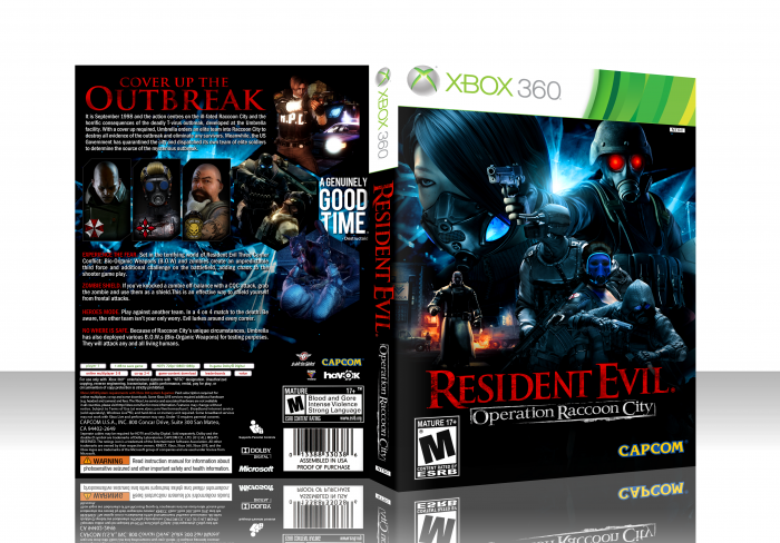
I always wanted to make another box for this. The last collab box I made for this was good, but there wasn't much material for the game. Now, a guy posted a load of renders and artwork and I just had to use it. Hope yall like. Please view in Full. Its very high res. Credit to Scorpion Soldier for temp.
 Resident Evil Operation Racoon City Box Cover Comments
Comment on jevangod's Resident Evil Operation Racoon City Box Art / Cover.
Dude, this is awesome.
[ Reply ]
Not so sure about the front, but I do love what you did on the back.
[ Reply ]
I agree with Bastart, the front has too much going on and doesn't let the eye rest in any one point. That is to say, there isn't an easily identifiable focal point. I jump to the light behind Mr. Redeyes, then to Redeyes himself. Some color variation might solve this, lighting adjustment as well.
That said, the back is the best I've seen from you. Solid layout. Overall nice job but the front could use some reconsideration.
[ Reply ]
I agree about the front, I like how clean it is and all but too much is going on there. Like hesit8 said, there's no focal point. The back though is great. Overall I really like how clean this is.
[ Reply ]
I think this is great. You should just use a slightly darker background because the template blends in with it.
[ Reply ]
great work please add printable.
[ Reply ]
Printable added.
[ Reply ]
Nice cover :)
[ Reply ]
Extremely clean technically speaking, but design wise it's too chaotic and disorganized for my taste. Basically, it's high quality work, but I don't like the layout.
[ Reply ]
Disorganized? I thought it was very organized when I made it. I thought it was great character placement.
[ Reply ]
@jevangod I think it's the 3 smaller characters being off to the right so much that is bothering me, also I think Mr.X breaks the flow up a bit.
[ Reply ]
I Love This Game , Resident Evil Series , Great Cover DUDE :)
[ Reply ]
amazing job, now it needs a printable version for PS3!!! I want my copy ^^
[ Reply ]