I've been working on this one for the past 3 days now. i mainly had a problem with the logo, if you've ever tryed to make one, you'll know what i'm talking about ;)
anyways, i hope you like this, please rate and comment.
#20, i think i will, i need to make the logo bigger like i said before, and i will need to recreate the whole thing (also, mentioned before) :P
expect an update...in a little bit :(
not only am i amazed at how well this box is doing (#54!!!) but i'm also amazed at how well i personally think the box is. i hope you lik eit. It's made form scratch and i think it looks better than ever =)
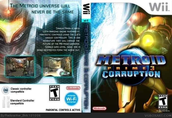
#12 I don’t think perfected yet, 1st of all right screenie on the back is from MP1, wrong game by mistake also details on the bottom are blunt, too thick link may help. Also the blue on the ‘the legend returns’ make it not so easy read, could change it green and to go all out, a more appropriate subtitle would be ‘the Bounty Hunter returns’.
The spine and front are perfect
#25, what "old pic"?
also, #26, thanx general, i'll try updating the back. i could only find 1 Metroid Prime 3 pic, but i'll keep lokking, and change the slogan.
Oh, i also wanted to point out that shouldn't the ESRB logo on the back actually have the contents (eg violence, language, etc)? Or is it different for Wii boxes?
HOLY SNAP IT WAS #1!!!! I MISSED IT!!!! al least it's #3, i'm VERY proud. thanx guys, you all just made my day so much better :)
#39, i could change it, i just figured nintendo want's everything simple, i haven't seen the back of a Wii box. I may go back and change it. =)
dude this is probably by FAR the best MP3 box i've seen. (Apart from 1, i can't remember who did it, but it's just as good as this) you are awesome. is it possible to rate 10/5? Lol. anyways i rate this the highest possible score.
 Metroid Prime 3: Corruption Box Cover Comments
I've been working on this one for the past 3 days now. i mainly had a problem with the logo, if you've ever tryed to make one, you'll know what i'm talking about ;)
anyways, i hope you like this, please rate and comment.
[ Reply ]
Nice, but the planet looks like it's about to take out Samus. 4/5
[ Reply ]
#2, thanx :)
[ Reply ]
I like this a lot . Probly your best .
4/5
[ Reply ]
correct me if i am wrong but isnt tht samus from super smash brothers brawl pictures. any way 4/5
[ Reply ]
#4, my best gets a 4/5? 0_o
jsut kidding, thanx ratchet :)
[ Reply ]
#5 who cares ? It still good boxart .
[ Reply ]
#5, i'm not sure, i don't think Samus is going to be in her suit in SSB:B, but i may be wrong, but thanx for the score.
[ Reply ]
#8, i dont know but any way i still ike the box
[ Reply ]
sexy, 4.5/5, the only thing that doesnt stir my noodle is the size of the esrb logo
[ Reply ]
#10, thanx, but the stirring of the noodle of the ESRB is good right?
[ Reply ]
if it stirs my noodle, its good, but unfortunately, the esrb DOESNT, in my opinion its too small, just my opinion
[ Reply ]
#12, too small? i don't know, i'll make it bigger and if it looks better i may update this ;) thanx.
[ Reply ]
update with a bigger & better Teen logo from the fine folks at the ESRB program. (yeah right...) Who keeps saying that?
<_<
>_>
[ Reply ]
thats so awesome. you just need a slightly bigger logo tho...
nevertheless, 5/5 i love it
[ Reply ]
I agree with Wicked, even though its not MP3 Samus and is a bit plain,
its clean and high quality, reeks of charm.
[ Reply ]
#15, thanx Wicked, i'll see about making a bigger logo, i deleted the file so i have to recreate the whole thing :P
#16, thanx General :)
[ Reply ]
I like it! keep up the good work!
[ Reply ]
#18, thanx Buell =)
i'm suprised at the score it's gotten, 80th place? not bad at all i say, now, if i could just get it on the top ten ;)
[ Reply ]
#19, Make a back and it may go up, either way I want to see it.
[ Reply ]
#20, i think i will, i need to make the logo bigger like i said before, and i will need to recreate the whole thing (also, mentioned before) :P
expect an update...in a little bit :(
[ Reply ]
#20, Yes! make a back!!!!
[ Reply ]
#22, wow, you really like this box dontcha?
thanx Monk :)
[ Reply ]
not only am i amazed at how well this box is doing (#54!!!) but i'm also amazed at how well i personally think the box is. i hope you lik eit. It's made form scratch and i think it looks better than ever =)
[ Reply ]
I like the old pic better
[ Reply ]
#12 I don’t think perfected yet, 1st of all right screenie on the back is from MP1, wrong game by mistake also details on the bottom are blunt, too thick link may help. Also the blue on the ‘the legend returns’ make it not so easy read, could change it green and to go all out, a more appropriate subtitle would be ‘the Bounty Hunter returns’.
The spine and front are perfect
[ Reply ]
#25, what "old pic"?
also, #26, thanx general, i'll try updating the back. i could only find 1 Metroid Prime 3 pic, but i'll keep lokking, and change the slogan.
[ Reply ]
awsome oh and everyone i would like to make an anouncement radioactive bobs real name is... MICHAEL,"ANN",TRIPODO.LOLROFL.oh and nice box 5.0/5.0
[ Reply ]
................. i'm speechless
(my middle name isn't "ann")
[ Reply ]
come on now we talked about opening up about things that are embarrasing (hahaha your middle name is ANN.)but we can get through this
[ Reply ]
alright, i have updated the back. It wasn't easy either :P
i REALLLY hope you like this. =)
[ Reply ]
This by far your best work ! 5/5 great !
Can't wailt to your next work !
[ Reply ]
thanx ratchetcommand :D
i only need a few more for the top 20 :P
[ Reply ]
I've been very busy lately but I'm really glad you listened to my suggestions, now I can say its perfect:)
[ Reply ]
#34, thanx General, but my # keeps going down! :(
it used to be 22... lol, it's funny but annoying. :P
but a "perfect" box from you is good.
[ Reply ]
I love this.....5/5
[ Reply ]
#35 - I wouldn't worry about numbers. You know this box is beautiful. We know the box is beautiful. Did i mention i think this boxart is beautiful?
Your best yet. Keep up the great work. (b^^)b
[ Reply ]
This is boxart is at number 1 now .
Congraulations .
[ Reply ]
Oh, i also wanted to point out that shouldn't the ESRB logo on the back actually have the contents (eg violence, language, etc)? Or is it different for Wii boxes?
[ Reply ]
HOLY SNAP IT WAS #1!!!! I MISSED IT!!!! al least it's #3, i'm VERY proud. thanx guys, you all just made my day so much better :)
#39, i could change it, i just figured nintendo want's everything simple, i haven't seen the back of a Wii box. I may go back and change it. =)
[ Reply ]
um..it was beter when it was only 1 side..theback is weak and realy plain..and so is the middle
overall 3.5 out of 5
[ Reply ]
#41, oh man! it's down to #34 :(
anyways i don't see how you think the black is plain. 0_o
[ Reply ]
#41,
The front is as plain as the back, yet you like the front. Someone needs to make up their mind.
And as for the lack of a ESRB info box, I get the feeling it is'nt allways essential.
[ Reply ]
it's not plain it's simple :(
lol, j/k, thanx general.
[ Reply ]
dude this is probably by FAR the best MP3 box i've seen. (Apart from 1, i can't remember who did it, but it's just as good as this) you are awesome. is it possible to rate 10/5? Lol. anyways i rate this the highest possible score.
[ Reply ]
#45, thanx Arcanus :)
[ Reply ]
#46 hey no problem radioactive bob you always do good boxes so expect this kinda praise 4 ur awesomeness.
[ Reply ]