Since my last FC3 box was so low quality, i decided to finish a old one, i started on a while back.
Hope you guys like it!
Printable added!
 Far Cry 3 Box Cover Comments
Comment on SimpleWig's Far Cry 3 Box Art / Cover.
HOLY &%$^ This is nice!
[ Reply ]
Thanks man : ), glad you like it!
[ Reply ]
Printable added!
[ Reply ]
10/10
[ Reply ]
Wow thanks!
[ Reply ]
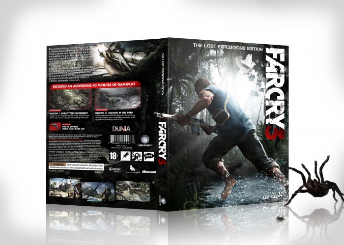
Great job! looks fantastic. The back is stunning, and the placement and the art on the front is really good. Kinda jumps right into the action.
Two things though:
1. The Ubisoft logo on the spine looks weird horizontally like that. Vertical is better. (personal opinion)
2. Some rating info on the front woul be nice. The red PEGI-18 rating even fits the style. ;) (but not necessary)
[ Reply ]
Thank you bro, and for your feedback! I do kinda agree now with the Ubisoft logo placement, it would look better horizontally.
And the PEGI-18 logo would cover that snake in the corner so i chose not to have it on, i also like the clean look better without it.
[ Reply ]
@SimpleWig
Maybe the PEGI logo UNDER the snake but in front of the bush? Maybe that looks cool and the snake gets a bit more attention (I completely oversaw it the first time). ^^
[ Reply ]
Awesome!
[ Reply ]
nice one!
[ Reply ]
Love the back :)
[ Reply ]
i think i pooped my self o_O
[ Reply ]