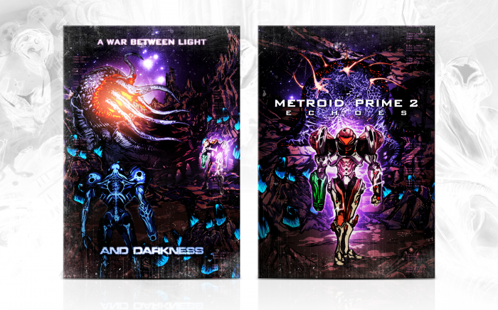
Metroid Prime 2 ranks amongst my favorite games of all time, and I felt I needed to follow up on my previous custom effort. Unlike Metroid Prime, which had a clean, anime-like style to it, I've gone with something darker and more heavily detailed. I wanted to express the game's darker nature. I might switch up the style again for Corruption.
Comments and critique are always welcome, of course.
[ Box updated on May 4th, 2012 ] [ original ]
 Metroid Prime 2: Echoes Box Cover Comments
Comment on Pleiades's Metroid Prime 2: Echoes Box Art / Cover.

Awesome, as usual. The feel of this box is awesome. Keep it up.
[ Reply ]
Great job sd!
[ Reply ]
Impressive!
Considered about re-uploading your previous MP project?
[ Reply ]
Well, it's still on his old account, he didn't delete it.
[ Reply ]
@Daemon you're right, forgot he used to go under the name of sd1833 :/ it was a Masterwork back than, couldn't we bring it back?
[ Reply ]
GOD DAMN
[ Reply ]
This is amazing, this better be HoF, because this definetaly deserves it. Great job, man.
[ Reply ]
Thanks, guys.
[ Reply ]
Can't wait for Corruption, nice work!
[ Reply ]
The only small gripe I have is that the 'echos' is a little small, but to be fair, that is not a real issue in full view.
Beautiful beautiful BEAUTIFUL work!
[ Reply ]
Exactly this, in my opinion.
[ Reply ]
And present you next HOF :)
[ Reply ]
Well, well. I wouldn't call this anything less than amazing. It looks like you really went out of your way to remove all the faults, and it shines through. I love the colour scheme, fits the game from what I've seen.
The only issues I have is that the "Echoes" part of the title is too small, and the font on the back is HORRIBLE and unfitting in my opinion and could be replaced with the title font, but I can overlook that as the rest is very good custom art. Great job overall.
[ Reply ]
I hadn't considered using the title font for the back. Along with increasing the size of "Echoes" I might see if I can work that into the design. Thanks for the comment, Sarashi.
[ Reply ]
This is the most beautiful thing I have ever seen in my life.
[ Reply ]
Couldn't have hoped for a better response from such a respected artist. Thanks, Koopa.
[ Reply ]
Holy shit
[ Reply ]
EPIC!!
[ Reply ]
Brilliant. But yeah, I don't like the font on the back.
[ Reply ]
Alright, I took the advice concerning the font and text size and made a quick update. Echoes is now more legible, and I changed the upper half of the back's text with a cleaner font to better reflect the light side of Aether.
[ Reply ]
It made an excellent difference. I would FAV again if I could, but sadly, I can't :(
It's about damn time I followed you.
[ Reply ]
Looks way better now!
[ Reply ]
Glad the update worked out. Thanks.
[ Reply ]
too much contrast.
[ Reply ]
I see. Thanks for commenting. Any thoughts on the artwork itself?
[ Reply ]
@Pleiades It's pretty good. Have you thought of selling some of it as a separate set of prints on dA or anything? You're pretty talented.
[ Reply ]
Great to see you finally uploaded it, and I would say without a doubt that it's my favorite custom box on the site. Well, this probably is my favorite box on the site. Excellent job here.
[ Reply ]
I really like the front! The back is a bit too cluttered and hard to understand for my tastes, though.
[ Reply ]
Agree, the back does look very busy. The colors are nice though even if a little bit too strong.
[ Reply ]
I see what you two mean, and I think it's due to the light crossing between Emperor Ing and Samus, which is illuminating the detail in the background. Samus and the Emperor should be isolated highlights, so I made this update.
link
Does that fix the issue?
[ Reply ]
It's all good, the only that that is bugging me is that Samus on the front looks like she is standing in place AND taking a step forward at the same time. beyond that though the artwork is very nice.
[ Reply ]
It's merely the way she's standing. One leg is placed slightly in front of the other, almost as if they're crossed.
[ Reply ]
Excellent, reminds me of your old MP box. I didn't know you're SD1833, but still, awesome box.
[ Reply ]
Thanks for pointing that out, I was wondering why it looked so similar to this:
link
Anyway, about the art, stellar work. I like it even better than the last one with its more vibrant colors. This artwork makes a really great poster.
[ Reply ]
I could see how that would be confusing, although I do allude to a prior Metroid Prime cover in the description. Thanks, you two.
[ Reply ]
holy contrast
Really awesome stuff here, amazing even.
[ Reply ]
Thanks, man. Glad you like it.
[ Reply ]
Sweet merciful crap this is gorgeous!
[ Reply ]
This is one of the best custom box art I've seen. If only it was printable!!! Then i could have this and your old Prime 1 box in real life :D
[ Reply ]
not uploading a printable for this cover it's a sin
[ Reply ]