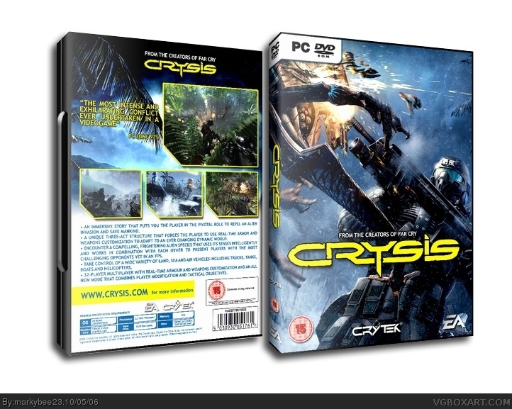
ok look...i used the same image on the front as mad soike...thast it....the back is totally different...there are so many images off the net so what do you want me to do...i do not have access to official art work. I used this image as i like it
#3, opps sorry I weren’t accusing you, just you've done two boxes that resembled Mad spike a bit and a front that looked like one after his accusation, its just a coincidence I'm sure, Spike didn’t make that material, you can do what you want with it you know it, I was trying throw the ‘copying idea’ of window. Also Ratchets comments don’t make that much sense often (sorry Ratchet).
So they happend to use the same image. Does it matter?
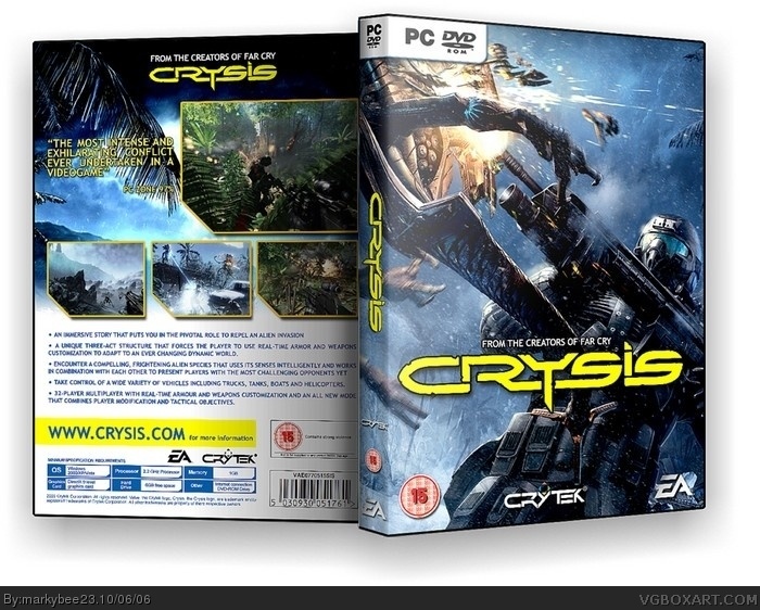
I think Mark's overall design is superior to any of the other Crysis boxarts on the site. It's simple, clean and to the point. My only gripe is that i'm not too crazy about that yellow but that's just a personal preference.
#5, in that case its all cool. your right the back layout of my half life box is similar but too be far if you look at the official half life 2 box his screen shots are layed outt he same...and yes so are mine....im not denying that....the front howeveer is totaly different...all ok though and thank you for clearing it up
 Crysis Box Cover Comments
Looks very samir to Mad spike .
But who cares ?
4.5/5
[ Reply ]
Reminds me too, hope thats a coicindence, no one likes copying but I believe it is a coicidence for the box 5/5 becuase its superb still.
[ Reply ]
ok look...i used the same image on the front as mad soike...thast it....the back is totally different...there are so many images off the net so what do you want me to do...i do not have access to official art work. I used this image as i like it
[ Reply ]
I like it alot. Looks official.
[ Reply ]
#3, opps sorry I weren’t accusing you, just you've done two boxes that resembled Mad spike a bit and a front that looked like one after his accusation, its just a coincidence I'm sure, Spike didn’t make that material, you can do what you want with it you know it, I was trying throw the ‘copying idea’ of window. Also Ratchets comments don’t make that much sense often (sorry Ratchet).
[ Reply ]
So they happend to use the same image. Does it matter?
I think Mark's overall design is superior to any of the other Crysis boxarts on the site. It's simple, clean and to the point. My only gripe is that i'm not too crazy about that yellow but that's just a personal preference.
Nice job. 8)
[ Reply ]
ANOTHER great job...Keep it up dude.
[ Reply ]
#5, in that case its all cool. your right the back layout of my half life box is similar but too be far if you look at the official half life 2 box his screen shots are layed outt he same...and yes so are mine....im not denying that....the front howeveer is totaly different...all ok though and thank you for clearing it up
[ Reply ]
looks not bad but i dont like the yellow font
[ Reply ]