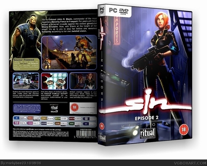
Its alright but you need to make the bottom logos bigger. and you should manipulate the front picture to make it more original. It looks like its a poster or somethin for the game. overall its not bad but Ill rate it if you fix these or whatever...
#1, err no, the Ritual logo being really small is the only problem, your unoriginal claims are garbage since I can see no other boxes cept from Bee's own work that looks like this, if you want the author to put flashy effects everywhere to make it original, you should know this has skill and simplism, this is one of the most official looking boxes on the site, 5/5 to the author.
#2, thank you for your comments. its only the 2nd box i have ever designed and thats of the same game.i do agree with ritual logo being too small and thank you for your score.
4, you're welcome. It annoys me that some people think boxes must be flashy to be original when thats mostly not the point, even not what the makers do with most boxes, however saying that you could change the screenshots on the back to make it a little more different from your other one even if thats not a tecnical flaw or at least rearrange them.
#5, i completely agree. I am a designer but I dont have access to every piece of game art on the planet.You make the best with what you can find on the net. Have no idea how some people make there boxes into 3D though. I use photoshop and i understand alot of people use something called gimp...whatever that is
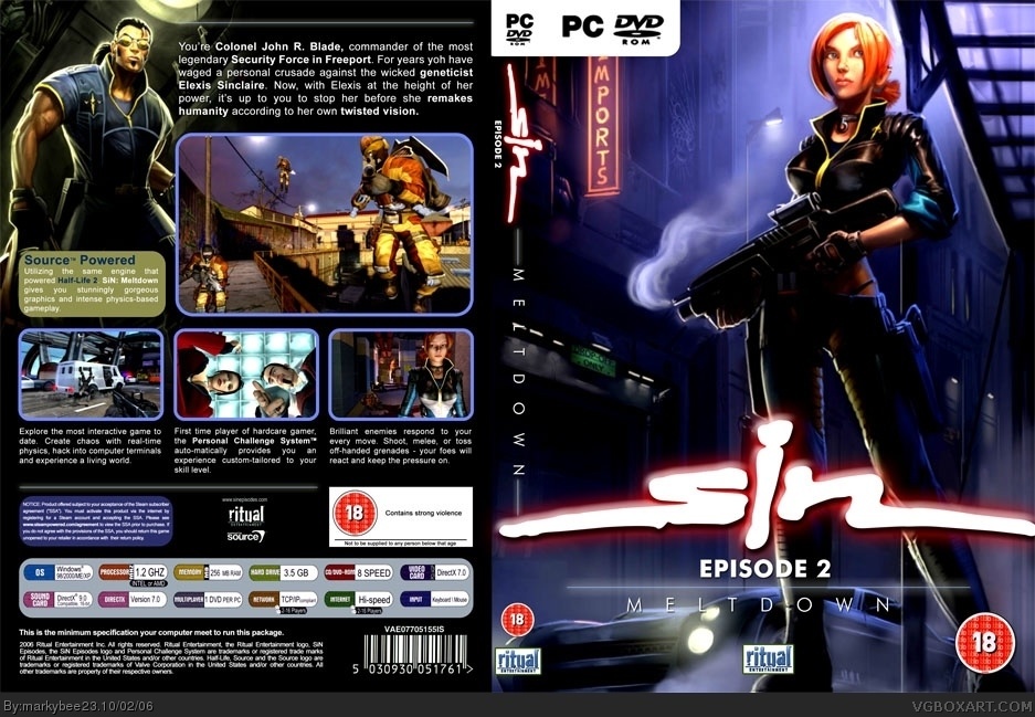
It's really just the main pics of your first box swapped, but I like that. It's like there's two versions of the box. That said, it might've been better as an update. Still, 5/5 like the last one.
#7, too be honest that was the point...i was going to use the girl pic on the 1st place and didnt. i decided to use it in the end and i do plan to change the back on this 1...but thank you for your comment and vote all the same
 SiN Episode 2 Box Cover Comments
Its alright but you need to make the bottom logos bigger. and you should manipulate the front picture to make it more original. It looks like its a poster or somethin for the game. overall its not bad but Ill rate it if you fix these or whatever...
[ Reply ]
#1, err no, the Ritual logo being really small is the only problem, your unoriginal claims are garbage since I can see no other boxes cept from Bee's own work that looks like this, if you want the author to put flashy effects everywhere to make it original, you should know this has skill and simplism, this is one of the most official looking boxes on the site, 5/5 to the author.
[ Reply ]
Everything looks great. Nice job.
[ Reply ]
#2, thank you for your comments. its only the 2nd box i have ever designed and thats of the same game.i do agree with ritual logo being too small and thank you for your score.
[ Reply ]
4, you're welcome. It annoys me that some people think boxes must be flashy to be original when thats mostly not the point, even not what the makers do with most boxes, however saying that you could change the screenshots on the back to make it a little more different from your other one even if thats not a tecnical flaw or at least rearrange them.
[ Reply ]
#5, i completely agree. I am a designer but I dont have access to every piece of game art on the planet.You make the best with what you can find on the net. Have no idea how some people make there boxes into 3D though. I use photoshop and i understand alot of people use something called gimp...whatever that is
[ Reply ]
It's really just the main pics of your first box swapped, but I like that. It's like there's two versions of the box. That said, it might've been better as an update. Still, 5/5 like the last one.
[ Reply ]
#7, too be honest that was the point...i was going to use the girl pic on the 1st place and didnt. i decided to use it in the end and i do plan to change the back on this 1...but thank you for your comment and vote all the same
[ Reply ]
#6 - People are using this little program to turn the art into 3D.
link
[ Reply ]