Hey guys! thanks to everyone in the wip for helping me out, i know i didnt post the final bits, but i just wanted to get it done. I worked really hard on this and I would appreciate some feedback. thanks!
 Metroid Prime Trilogy Box Cover Comments
Comment on TheNiceGuy's Metroid Prime Trilogy Box Art / Cover.
Holy crap, that's amazing! :D
[ Reply ]
thanks! Worked hard on it. Hope it gets into the hof :D
[ Reply ]
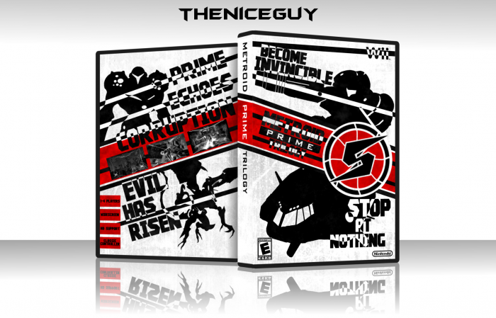
Very good, the text is a little hard to read though.
[ Reply ]
Looks like a comic poster or something but it's cool.
The negative lines were clever
[ Reply ]
Very Nicely done!
[ Reply ]
Probobly your best work yet. Great job. Only complain I have is that the white lines going through Samus and the tagline on the back are really unnapealing. Same with the front. You should get rid of those all together because it makes everything hard to look at and harder to read. It would probably be cool to look at if it only happened once where you have "Stop At Nothing", but everything else is just making it look too messy. But still a cool design
[ Reply ]
I know what you mean, it's messy, but it would be too plain if all that wasn't there. And what do you mean by the tagline? prime, echoes, corruption are the names of the games, and the other tagline does seem out of place, but I like that style, so I want to keep it, in my opinion.
[ Reply ]
@TheNiceGuy
Yea i meant the names of the games. And it is a good box, just pointing out the things that are stopping it from being an amazing box. And with using silhouettes, usually making it more plain works out better for the overall look. Like at first glance of the back, i had to squint to figure out what is happening. But like i said, it is a good box and it is your box you should do whatever you think is best :)
[ Reply ]
It's pretty good, although I agree with what Deadpool said, the text is pretty hard to read.
[ Reply ]
That's so awesome!
Well done, man.
[ Reply ]
Interesting. I'm not sure if it fits well with the Metroid Prime trilogy, but it's certainly creative and unique.
[ Reply ]
I wanted to do something different, everyone always does something different with other series, but know one ever trys to change up metroid.
[ Reply ]
Really nice man.
[ Reply ]
Thanks man. Printable is on the way for whoever wants it.
[ Reply ]
Not bad. I'm not really a fan of the strong contrast and clashing colors but it's definitely different and unique which is always a plus in my book.
[ Reply ]
I'm not sure how I missed this. I love the contrasting colors.
Nice job +fave.
[ Reply ]
This is fantastic!
[ Reply ]
To me this seems more like an offical poster for the game rather than box art, but I can't argue with how amazing it is.
[ Reply ]