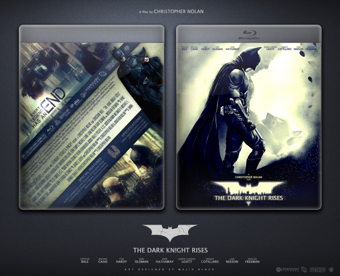
I like what you did on the front both on the logo and the image blending look fantastic. I'm not really a fan of the tilted back, but it ain't bad at all.
I'm not a huge fan of the inclusion of the fan made Catwoman, it kind of throws off the official feel of the box.
Everything else though, is brilliant.
I've been waiting for something like this from you. While your past boxes have been good, it's started to feel like the same thing re-skinned. This, however, is a different style than what you have been posting, and it looks great. I really like the colors and lighting.
I like the washed out color scheme, and how you've taken an overused image and added a few touches of originality to freshen things up. I fear the back is a little too slanted, almost vertically, but otherwise it's good.
 The Dark Knight Rises Box Cover Comments
Good one
[ Reply ]
Thanks :D
[ Reply ]
I like what you did on the front both on the logo and the image blending look fantastic. I'm not really a fan of the tilted back, but it ain't bad at all.
[ Reply ]
Thanks for comment man :)
[ Reply ]
I'm not a huge fan of the inclusion of the fan made Catwoman, it kind of throws off the official feel of the box.
Everything else though, is brilliant.
[ Reply ]
You right man, Thanks.
[ Reply ]
Agreed. Great box and presentation though.
[ Reply ]
Looks amazing. The front is just awesome! The back is great aswell.
[ Reply ]
I glad you like it :D
[ Reply ]
Epic! :D
[ Reply ]
Thanx :D
[ Reply ]
Very nice man. Not entirely sure why there are random leaves on the front but it does look good. Color scheme is also very interesting. I like it
[ Reply ]
Appreciated man :)
[ Reply ]
Nice man, I love the colors and how all fits right together, I'm not a fan of the slant added to the back though.
Sorry for my English !
[ Reply ]
Nice, very nice. Well made, mate.
[ Reply ]
Oh my.
[ Reply ]
This is delicious.
[ Reply ]
Nice box, not my favorite from you, but this is a nice box.
[ Reply ]
I like it:) Yeah the catwoman on the back doesnt look right even though it suits, apart from that very offical looking. Nice work.
[ Reply ]
I've been waiting for something like this from you. While your past boxes have been good, it's started to feel like the same thing re-skinned. This, however, is a different style than what you have been posting, and it looks great. I really like the colors and lighting.
[ Reply ]
i like colors...
[ Reply ]
Front Is great but I'm not a fan of a super slanted back design. That tag line looks great though!
[ Reply ]
nice mate . hope to win hall of fame
[ Reply ]
niceeee
[ Reply ]
Wow, I'm very impressed, well done! ;)
[ Reply ]
I like the washed out color scheme, and how you've taken an overused image and added a few touches of originality to freshen things up. I fear the back is a little too slanted, almost vertically, but otherwise it's good.
[ Reply ]
Incredible job!
[ Reply ]
That's well deserved!
[ Reply ]
Congrats Men
[ Reply ]
Well Deserved
[ Reply ]