![]() »
»
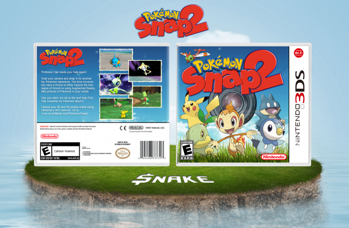
Hey everyone, this is my first box so I hope you guys enjoy it. Thank you to everyone who helped me out in the newcomers WiP section. Very much appreciated! Critique and criticize as much as you want, I love feedback on my work.
 Pokemon Snap 2 Box Cover Comments
Comment on $nake's Pokemon Snap 2 Box Art / Cover.
Great for a first. Welcome to VGBA.
[ Reply ]
Thank you :)
[ Reply ]
Very nice indeed, welcome aboard!
[ Reply ]
Thank you very much for your help in the WiP section too! :)
[ Reply ]
Great work! The back is a bit plain, but other than that, it looks good.
[ Reply ]
This. Welcome to the site. :D
[ Reply ]
Awesome for a first. Welcomr to VGBA
[ Reply ]
Thats great, especially for the first! If you ever need some help, feel free to ask :3
[ Reply ]
Ah very nice for a first. the back is very plain though. Could use some renders of not the Pokemon but the main guy taking pics. The front is nice. The logo is great though. And I think that the camera lens is too....realistic for a pokemon game and has too much detail...
Overall very nice though :) cant wait to see more from you
[ Reply ]
For a first, this is not bad at all. Being Pokemon Snap, though, I would expect more attention drawn to the photography mechanic. Perhaps including Todd Snap somewhere on the back (perhaps taking a photo or two of some Pokemon).
[ Reply ]
Wow, this is actually pretty good! Nice job. :)
[ Reply ]
Oh, very nice!
Congratulations, man. :D
[ Reply ]
Ohhoooo, Sexy!
[ Reply ]
For a first, good job :)
[ Reply ]
I can't believe it's a first, Awesome!
[ Reply ]
And so the newbies are making better boxes than I. Time to retire xD
Great Job =)
[ Reply ]
Thank you for the incredible feedback guys! :)
[ Reply ]
Welcome to the virtual lair of the most finest minimal boxarts :P
(The big dominator in comparing to the NeoGAF Community)
Incredible job on your first box! You sure got a lot of potential ;)
[ Reply ]
It comes off as a bit playful. Something I'd expect a PS2 box to look like.
+Fav
[ Reply ]
The back feels lacking to me... maybe it's the gradient.
[ Reply ]
Great first! It looks great, except for the lens on the front. It just doesn't fit in with the cartoon renders.
[ Reply ]
This is great for a first. The back comes of as a little bit dull, but it's still not bad. I love the presentation, too. :)
[ Reply ]
Excellent
[ Reply ]
Well done, the presentation looks amazing too.
[ Reply ]
Thank you :)
[ Reply ]
I can see 2 flaws: The mudkip renders looks very flat and the SNKE looks very bold compared to the other text, still it's nice!
[ Reply ]
Thank you for addressing those flaws, I will fix them :)
[ Reply ]
Amazing work for a first, keep it up. :)
[ Reply ]
Great first, you got a lot of potential. Make some more boxes!
[ Reply ]
I don't like much the mix of real life grass and the anime styled renders, both front and back look somewhat empty (Front, check the space between Chimchar and both Turtwig and Piplup, should be smaller, in my opinion; back, the lack of renders and the thin font makes it look empty), and I think the purple/blue outer glow on the logo (Specially over the "2") doesn't look good.
Great for a first, anyway.
[ Reply ]
its pretty coo
[ Reply ]
The back is very bland, but the front looks really good and official.
[ Reply ]
niceeee!
[ Reply ]
This presentation looks so sick, I need to step up my presentation game yo.
[ Reply ]
I'm confused....I could of swore this was yesterdays HOF...
[ Reply ]