Already box no.70!
This time I took a more action based RPG (which I haven't played yet, but I assure I will soon, after playing the demo from PSstore which I really liked)
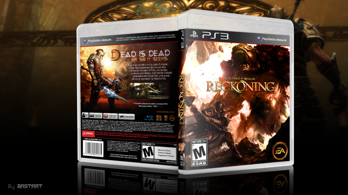
Something a bit different from the actual box art, as I used the front image on the back (which I founded more suitable to the text and screens layout) I really had fun playing with the lightning and actually ended up with 2 versions of this box the other is even more darkened than this, but in the end I prefered to post this version)
 Kingdoms of Amalur: Reckoning Box Cover Comments
Comment on Bastart's Kingdoms of Amalur: Reckoning Box Art / Cover.
1st fav & 1st comment.
Awesome art box for a game that was hyped as a great condender against skyrim but failed miserably.
[ Reply ]
it was? Never heard that. I have the game and I love it but I would never try and compare it to skyrim....thats odd lol
[ Reply ]
This game is more like a pop-version of Dark Souls mixed with a lot of Fable. Not much Skyrim to see in this.
@Bastart: Great box, like always!
[ Reply ]
Skyrim is trash compared to this game. It's absolutely fantastic.
[ Reply ]
@Daemon
haha well the modded and enhanced pc version of Skyrim is hella good, but you are right that this game is fantastic
[ Reply ]
@Deividas I agree, it's a totally different approach on a RPG kind of game (more action-driven) it's pretty easy compared to Skyrim from what I've played, but very deep from what I've heard and saw on gameplay videos) Defenitily not a type of game for the pro-gamer imo. but more for the casual-gamer, which are mostly not really into this kind of games, like I am.
[ Reply ]
Very nice, You are my hero :D
[ Reply ]
that's right, my name is Optimus ;) lol
[ Reply ]
Great work!
This is the only Reckoning box on the site!
[ Reply ]
Nice one. I really want to try this game as well. :)
[ Reply ]
I don't necessarily understand the almost unanimous love this game receives, but this cover does well to present it in a nice light. The tagline font seems oddly out of place, but otherwise I can't say anything is in dire need of change.
[ Reply ]
Love? At IGN they overreact with a outstanding '9.0'
but Gamespot gives the game a fair and decent '7.5'
The tagline is a bit overwhelming and not blending with the rest
that I agree, but I thought it would fit with the 'rise from the dead' theme and make it stand out more with those crosses which come as a part of the font, just my choice in design though.
[ Reply ]
@Bastart I hadn't read any reviews, it just seemed like wherever I turned people were praising it endlessly. I've seen and played it, and while it is entertaining, it's pretty standard WRPG fare.
I had thought of the opening moments of the game, rising from the dead, but hadn't considered it as a key element of the game. If you look at it that way, the font does seem more fitting.
[ Reply ]
That's really splendid!
Beautiful work. ;-)
[ Reply ]
I LOVE THIS SIR!!!! :rainbowbarf:
[ Reply ]
so epic!
[ Reply ]
i joined this website yesterday and i need some help on my designs so can u pls look at mine and tell me what u think
[ Reply ]
I like that template.
[ Reply ]