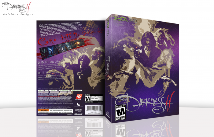
So I decided to delete my other box, didnt like it enough to keep it up and replace it with this :) Got the game a couple days ago and I love it. Not the greatest game but still very nice. So here is my cover design for it. Not really much else to say. I hope you all like and comments and favs are always appreciated :)
 The Darkness II Box Cover Comments
Comment on Deividas's The Darkness II Box Art / Cover.
Should I bother to comment or are you going to delete this box as well?..
[ Reply ]
This is staying up
[ Reply ]
This is unrelated but I just want to say that I always confuse you two. You both have verrry similar names and your boxarts are kinda alike.
[ Reply ]
@Unknown Flames
haha yea i see what your saying
[ Reply ]
@Unknown Flames haha..we might have similar names but I don't think our boxes are that alike. :)
[ Reply ]
This is look great man!
[ Reply ]
Very nice job, I love the purple.
[ Reply ]
Awesome!
[ Reply ]
Really love this.
[ Reply ]
Very original choice of style. I'm on kind of a nitpicking rant, so sorry to bother you with it.
I really, really wish you would've picked another colour instead of the red on the ''2'' part of the logo and for the tagline on the back.White, dark brown or something similar would suffice in my opinion.
I'm also not a big fan of how the screenshots are presented. I've thought about this and I can't quite come up with a solution.. I guess it's one of those things in which you'll have to experiment if you wish to change it.
Besides those small details, I am a big fan of how you edited the art and I can see that alot of effort went into it. Therefore I shall fav this box. Awesome work, lad!
[ Reply ]
I'm usually not a big fan of the cut-out filter effect used on images
but for this I make an exception, it turned out great ;)
I do agree with Ayron about the color of the tagline on the back,
I'd suggest to make it white, silver or some kind of gradient .
[ Reply ]
nice work mate
[ Reply ]