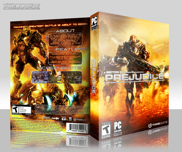
You've really stepped it up, wow. A few issues though, one being that the scanlines are a little too much. Another is that the contrast seems to be way too high, especially on the back. Still, this is your best design by far.
Like I said to Javen the perspective on the template is off. Take a look at his Sonic vs Fire Emblem to see the difference. link
Makes it look better. Though the main critique is in the art. Great work on the front blending in more robots. Looks great. Also the touch of more orange looks a lot better and more vibrant. The back is good too. I would suggest not center justifying the text, it doesn't read well and looks better left justified. I think if you turned down the effect on the back similar to the front and turned it down even further on the images so it was subtle it would look a lot more fluent.
Great job, looks great and congrats you are pretty much on the front page under images on google. You barely have to scroll to see it.
 Section 8: Prejudice Box Cover Comments
..........I hate you XD
[ Reply ]
Love you to :P
[ Reply ]
@Ronthis the Werewolf You just diverted what little attention my box was already getting... :|
[ Reply ]
Damn man, good work!
[ Reply ]
What happened to you, man? This is above and beyond anything you've ever made before. Fantastic.
[ Reply ]
This is so much better than any other box you have done.
[ Reply ]
Heh, you really think so? Thanks! :D
[ Reply ]
Definitely your box box yet.
[ Reply ]
Thanks xD
[ Reply ]
Box box? XD
[ Reply ]
Wow! Awesome!!
[ Reply ]
A visual slap!
That's just amazing, congratulations.
[ Reply ]
Best your box yet!
[ Reply ]
Excellent job man
[ Reply ]
You've really stepped it up, wow. A few issues though, one being that the scanlines are a little too much. Another is that the contrast seems to be way too high, especially on the back. Still, this is your best design by far.
[ Reply ]
Good gravy...
[ Reply ]
Dayumm. So, so good.
[ Reply ]
I feel the need to compliment the back again. Sublime.
[ Reply ]
Really nice.
[ Reply ]
WOW great box man 5/5
[ Reply ]
Thanks for the comments and favorites, guys! :D
[ Reply ]
I'm extremely impressed with your improvement. Wow, this is great man.
[ Reply ]
I saw the box before I saw who made it and was surprised when I saw who made it. Nice improvement.
[ Reply ]
Sad I missed this, it's bloody awesome
[ Reply ]
Great job on this one. I love the back.
[ Reply ]
Awesome job man!
[ Reply ]
Since when did you start making good boxes?
[ Reply ]
Ouch, man.
[ Reply ]
good!
[ Reply ]
Congrats on hall and I somehow favourited this box twice :)
[ Reply ]
Congrats on the hall.
[ Reply ]
Congrats on the Hall. This one took a while...
[ Reply ]
Holy crap, thanks so much you guys! It really means a lot getting my first HoF :D
[ Reply ]
bout TIME
[ Reply ]
Amazing Design...
[ Reply ]
OMG!
THis is fucking amazing!!!
[ Reply ]
Congrats man ;) it was about damn time, this hit the HOF.
[ Reply ]
This deserved it! Should've got HoF sooner. Congrats.
[ Reply ]
Like I said to Javen the perspective on the template is off. Take a look at his Sonic vs Fire Emblem to see the difference. link
Makes it look better. Though the main critique is in the art. Great work on the front blending in more robots. Looks great. Also the touch of more orange looks a lot better and more vibrant. The back is good too. I would suggest not center justifying the text, it doesn't read well and looks better left justified. I think if you turned down the effect on the back similar to the front and turned it down even further on the images so it was subtle it would look a lot more fluent.
Great job, looks great and congrats you are pretty much on the front page under images on google. You barely have to scroll to see it.
[ Reply ]
Thanks for the C+C. I see what you mean, I'll try skewing it a little less.
And that's so awesome :D
[ Reply ]
Great but I don't think the 'About', 'Features' and 'Screenshots' sub-headings are necessary.
[ Reply ]
Im not really a big fan of pc game covers, but damn! nice 10/10
[ Reply ]
This is perfect! Make it printable man! xD
[ Reply ]