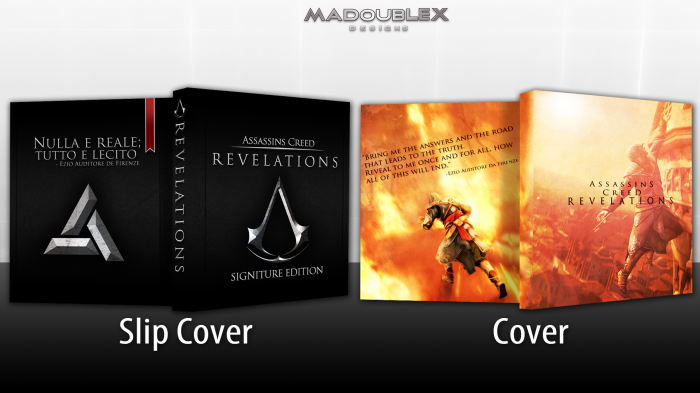
Ok, so this is my box for Kickstart2012, and I'm really proud of this. PLEASE look at the printable for this one. Not much else to say. Thank you everyone who helped in the WIP!
inbeforespellingerroronfront
 Assassin's Creed: Revelations Box Cover Comments
Comment on madoublex's Assassin's Creed: Revelations Box Art / Cover.
Yes! :D
[ Reply ]
Sweet Baby Jesus, that's good.
[ Reply ]
This is very nice. LOVE the slip cover, great job man. On the spine, revelations could have been a little smaller but no biggie. The only thing im not a fan of is how the slip cover and the actually cover...both look like slipcovers. Maybe thats due to the fact that there is no sign of a template at all on the actual cover itself, which maybe you should have put some kind of sign for which system this was for. Either on the slipcover or the actual cover.
Now for the cover itself, there is a huge difference in the lighting of the 2 ezios, which if thats what you were going for, then fine, but I would have liked to have seen the lighting match with the one on the front. But thats just a personal design change i would have done :)
But overall, the slip cover alone should get you a fav. Very nice
[ Reply ]
Thanks man! I was originaly going to put the same lighting on the back as well, but I thought it might have been overkill. Also, I could add a subtle template to it, and I think I'm going to. Thanks!
[ Reply ]
I love!
It's both simple and wonderful.
Perfect work.
[ Reply ]
The huge "Slip Cover" and "Cover" text on the presentation is distracting. Nice work on the covers, though.
[ Reply ]
Thanks Reed! I think I might make it a bit smaller.
[ Reply ]
Pretty nice :D
[ Reply ]
The slip cover looks cool, but the typography on the main case, front and back, throws it all off for me.
[ Reply ]
I can understand your distaste for the back, but could you be more specific on the front?
[ Reply ]
nice cover
[ Reply ]
I like the slip cover, and the front of the actual case, but the back is pretty weak. I don't particularly like the image choice, or the text placement. Other than that, good job.
[ Reply ]
Looks really nice man!
[ Reply ]
I like the slip cover, very sleek and suits the game well but the actual cover, while having nice covers, doesn't really compare to the slip. I dislike the back, looks like Ezio is committing suicide in flames.
[ Reply ]
Thanks for the comments and favs everyone!
[ Reply ]
Oh, I really like it! The slip cover looks great.
[ Reply ]