I gotta ask, where is everyones Kickstart boxes!? I've only seen a few so far, everyone get to posting!
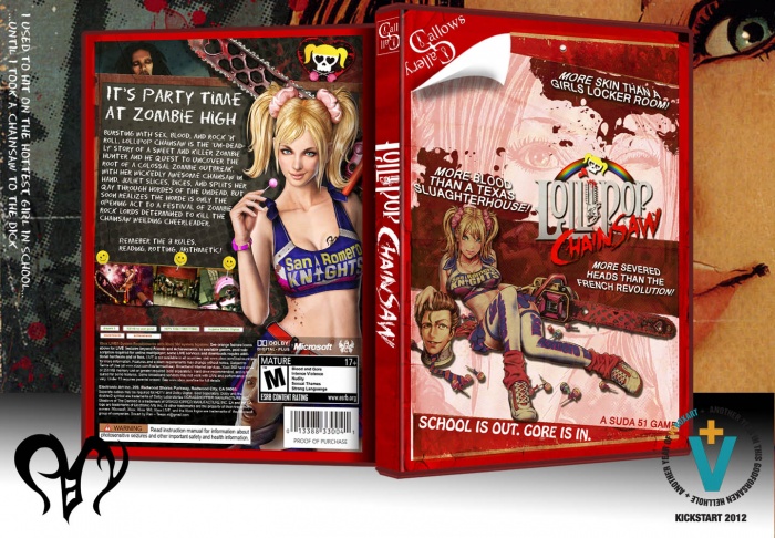
Anyway, I've been waiting to post this one, and I love the way it came out and can't wait for this game! Printable is available, but like any unreleased game the info is wrong, and a version with the regular Xbox 360 template is also available.I'm aware there is no reflection, and honestly I don't care, but I would love comments on the design or the collection, so post away please! : )
 Lollipop Chainsaw Box Cover Comments
Comment on Pan's Lollipop Chainsaw Box Art / Cover.

Hawt..
[ Reply ]
You rock man, very nice!
[ Reply ]
Great use of quotes on the front and a very solid looking back with a very fitting chalkboard font. A reflection would actually hurt an old-skool looking box as this imo. so it's not a big deal you've left it out.
The only nitpick I'd point out is that you've misspelled 'slaugtherhouse'
b.t.w. Is that the actual logo? it isn't really poppin' in terms of a strong title though , it may be due the grey on the logo or the size idk.
[ Reply ]
That is the official logo and thanks for pointing out the typo, means I can fix it before the game comes out.
[ Reply ]
@Pan No prob. Okay, well it looks a bit plain to me.
b.t.w. I'd like to see what you come up with on a box design, as I'd say 'The Darkness II'
[ Reply ]
The game looks like shite but this is great work. As always. :)
[ Reply ]
Thanks but I've gotta say this game looks AMAZING! It's got just about everything I'm into though. : P If anyone wants to see the official template version, check the printable.
[ Reply ]
Not on the topic of the box, but I think the game looks amazing as well. Very unique style and it looks like the gameplay will be pretty fun.
[ Reply ]
Suda 51. Argument invalid.
[ Reply ]
I think the logo and, uhhh, cheerleader on the front could use some lightening up but other than that great work.
[ Reply ]
I wish I could give a box such an authentic retro style like you have in this. Fantastic design and it's very fitting of the game.
Love the taglines you have on the front by the way ;)
[ Reply ]
So awesome!
[ Reply ]
I will fav anything and everything from the Gallows Gallery. I really dig the style.
[ Reply ]
Very impressive, this cover is very detailed, I just love. Congratulations!
[ Reply ]
Just awesome. I think you can do no wrong in the gal gal
[ Reply ]
I like the artwork you chose to use for the front. It matches well with the color scheme and the Gallows Gallery as a whole. I feel the contrast could be bumped a notch though, the wo characters as well as the logo look somewhat bland (in terms of color in lighting).
[ Reply ]
Yes,
[ Reply ]
Fantastic. I'm gonna use this on my copy.
And I really love it best when artists here break from the regular packaging template. If you only draw inside the lines you can only create a finite number of things.
[ Reply ]
Absolutely Nice :D
[ Reply ]
I appreciate the bump into the hall, thanks for the support guys.
[ Reply ]