![]() »
»
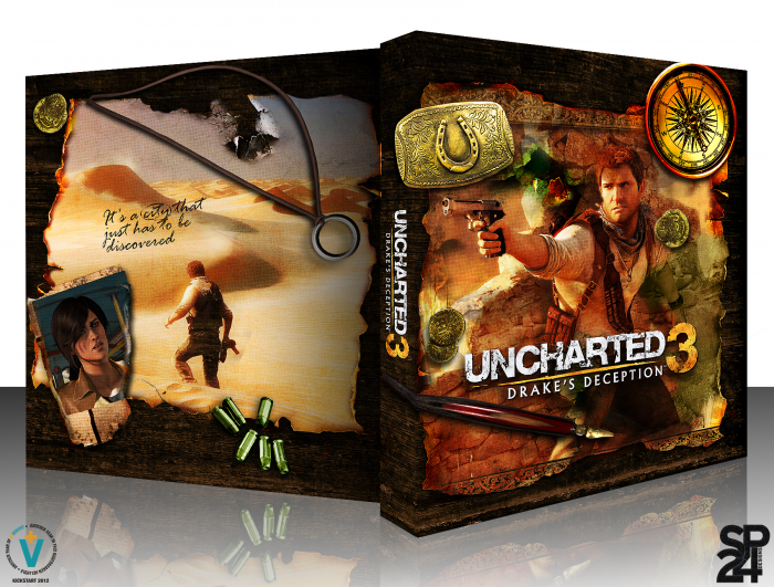
So here it is, my first box since KickStart 2011. I'm pretty happy with it, especially with what little spare time I've had lately. Hopefully this won't be my last of the year, like the KickStart 2011 event. Critiques would be great, as well as any comment you may have. Please view in full as well.
 Uncharted 3: Drake's Deception Box Cover Comments
Comment on Spiderpig24's Uncharted 3: Drake's Deception Box Art / Cover.
Oh my.
[ Reply ]
Nice one.
[ Reply ]
This better not be your last box this year.
+fav
[ Reply ]
It won't be, working on what I hope to be my best one ;)
[ Reply ]
Finally a cover deserve the game, very nice.
[ Reply ]
The back is a little plain, but my god, everything else looks sexy.
[ Reply ]
I kinda wanted this to be a little more subtle than the usual official box with more text, screenshots, etc. so that's where the simplistic look for this came from.
[ Reply ]
So you've finally posted it.
Your work with the various textures and adjustments to contrast and color are really impressive, and aesthetically there's nothing in dire need of change.
A minor issue I do have, is the shading. Specifically, smaller items like the golden coins or Drake's ring have inaccurately large, blurred and low-opacity shadows, giving the illusion that they're actually not sitting directly on the paper. Something small, like a ring or coin, isn't going to produce a very large shadow in the context of the lighting in this image, and so they end up looking unnaturally out of place.
[ Reply ]
Ah yes the shadows. In the 2D version of the box I think the shadows look much better, in accordance to the light source. When I put the box in 3D I didn't go through and check the shadows, or change them to fit with the new perspective, so they do look somewhat off.
[ Reply ]
The same opinion but nice
[ Reply ]
Great box art to follow up your UC2 box art.
[ Reply ]
Fantastic work.
[ Reply ]
Beautiful, I love the simplistic back.
Though I do agree with Pleiades about the shadows.
[ Reply ]
Great design!
I agree about the shadows though, it should add a bit more realism to the scene.
[ Reply ]
That, is so cool.
[ Reply ]
Thanks for the comments, critiques and favorites everyone. It's been a great KickStart and this has definitely got me back into designing covers again.
[ Reply ]
I'm liking this
[ Reply ]
just amazing buddy
[ Reply ]
Tasty.
[ Reply ]
This is pretty awesome.
[ Reply ]
really nice
[ Reply ]