Stepping out of my comfort zone and creating something I have never done before.
A simple and minimalism design for the best game ever made - BioShock.
Leave a comment below and let me know whether I failed or succeeded in this particular style.
Thanks and view full size!
 BioShock Box Cover Comments
Comment on deiviuxs's BioShock Box Art / Cover.
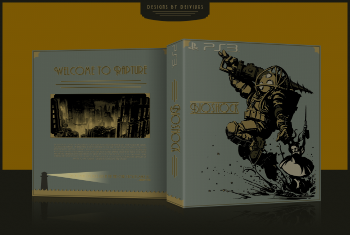
The front is amazing, The back really feels lacking though.
[ Reply ]
Agreed, the text could be a bit spiced up (color-wise) in relation to the grey-ish background and the picture don't seems to be that exiting as it is on the front, it doesn't always have to be but it look like yet another city imo. The lighthouse with beam trough the quote, waves flowing untill the spine and small details as the corner emblems are rather excellent though.
I'm stupid not to fave your daring choices of colours and typography.
[ Reply ]
@Bastart Thanks. The color for the description was chosen to match the color of the Little Sister dress on the front. The image was chosen in order to show Rapture - the underwater city.
[ Reply ]
I like it, the back more than the front, especially in full view. The entire box seems to have a light texture to it, which is a nice addition to the subtle imagery. At first I didn't particularly care for the gray background but in full view it looks nice. Pretty great job here.
[ Reply ]
I really like this. It almost seems to be a bit darker than I would like, but in full view it looks excellent. Great work.
[ Reply ]
It's interesting, how a change as minor as a subtle texture overlay can make all the difference in a design like this. The addition was minimal, but in the final result you see it does wonders for what could have otherwise been a relatively bland, somber backdrop.
[ Reply ]
Thanks guys. It's funny but the texture was added last minute. Glad you guys like it and don't be shy and give me some more feedback.
[ Reply ]
The text is hard to see, but otherwise it looks good.
[ Reply ]
Really well done. I love the front, and I like the back. The only complaint I have is that the description text is hard to read. You could add a small stroke to help it stand out better.
[ Reply ]
I really don't have any problems reading description in full size. I'll add printable later, maybe then the description will be easier to read.
[ Reply ]
I love the front, but I find the text hard to read on the back.
Everything else is very good though
[ Reply ]
Printable added. View it for hi-res and I'm pretty sure you'll be able to read all of the text just perfectly.
[ Reply ]
Great box. The only problem I have with it is that the text on the back is a bit too bright. Otherwise is a good box.
[ Reply ]
hhhhhhhooooooooooolllllllllllyyyyyy cccccrrrrrrrrraaaaaaaaapppppppp!!!!!!!!!!!!!
[ Reply ]
I really dislike the color scheme. It might seem retro/vintage, but it actually looks very ugly. I'd also like to point out that the part of the quote closest to the lighthouse is hard to read, and that I don't like how the waves suddenly stop before getting to the front.
Sorry, but I don't like this.
[ Reply ]
I wanted to go for a different color scheme as usual. First part of the quote supposed to be hard to read behind it's behind the light, waves suddenly stop because they did not fit on the front, I tried.
No need to say sorry if you don't like it. I understand and appreciate the honest feedback.
[ Reply ]
the front is amazing but the text on the back is too small
[ Reply ]
How did I miss this?
Anyway, very nice man, I absolutely love the simplicity on this one!
[ Reply ]
holy crap this is amazing.
my fav game and now a fav box
[ Reply ]
I don't know how this didn't get more attention, I love it! Fav from me.
[ Reply ]
Nice Style And Nice Box,Like it . . .
[ Reply ]