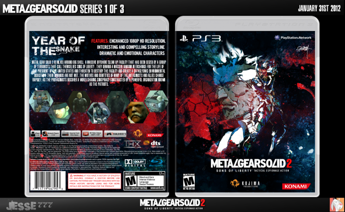
I am creating each of the Metal Gear Solid games that are on the HD Collection one at a time each individually. This took a week at least to get everything in order and organized, if you spot any mistakes then I might fix them but don't hold your breath. Anyways thanks and hope you enjoy!
Credits Sens for Template and Deivuxs for the rest of the template.
Please Comment and Favorite if you wish.
Credit to Indexenos for the DNA Pattern on the front btw. Credit to Bruceleeroy of NEOGAF for little pieces of the wallpaper I used on the front and back.
1ST Update: Removed shitty disorganized screenshots and made my own hexagon ones which I took from a Metal Gear Solid 4 wallpaper. Also added Features to the the top right hand corner of the back. Moved the synopsis to center instead of it being near the bottom. Also moved the tagline a bit and resized it slightly.I just now realized that I put down 1080p and it says 720p. Hopefully the back is less of a pain to look at. Thanks for the critique Spiderpig and Daemon!
[ Box updated on January 1st, 2015 ] [ original ]
 Metal Gear Solid 2: Sons of Liberty Box Cover Comments
Comment on jesse777's Metal Gear Solid 2: Sons of Liberty Box Art / Cover.
I'm not sure about this one, it seems to be just all over the place and it's really difficult to tell what's going on. I do like how you chose to go with a different color scheme, but on the back I honestly can't tell what that is behind the screenshots. I haven't played the game, but I don't see how the DNA pattern fits into the game at all, and it looks pretty out of place on the front. Not a terrible box by any means, but I feel it could have been a lot better.
[ Reply ]
I told you in our chats. This is awesome work.
[ Reply ]
My favourite box this month by a mile.
Excellent work here jesse :)
[ Reply ]
The front is awesome, but the back is really unattractive and random. There doesn't seem to be any set design for the back.
[ Reply ]
I just feel the need to say the front is really awesome again. It's absolutely sublime.
[ Reply ]
Yes.
[ Reply ]
The back will be improved in due time Daemon that is priority number one it was a experimental layout at best I shall look at the covers of my past and do what I did back then I even despised the back before I posted the final version. Back's have never been my strong point.
[ Reply ]
Much better than before.
[ Reply ]
Could of swore that I favorited this.
[ Reply ]
I thought it couldn't get any better.
It just did.
[ Reply ]
I'm liking the new front and the new back, Well done.
[ Reply ]
The front looks particulary sweet. The hexa's and DNA pattern kinda work in weird way for me (slowly being pulled to the AC direction.......)
The header (a bit on the dull side) and text on the back could be better though :/
There's something about the synopsis and features text that isn't looking quite right to me, I think it's mainly the size and space between the words.
[ Reply ]
hexa's and DNA is a MGS2 trademark
[ Reply ]
I like the front
[ Reply ]
Good front. Image distortion and blurriness aside, Shinkawa's artwork blends into the muted blues and vibrant reds pretty smoothly, and the shreds of white centered in the otherwise dark colors draws your attention to Snake and Raiden. I'm also liking the MGS4-style logo.
The back, I'm afraid, doesn't quite hold up as well. The hexagon screenshots is a solid enough idea, but the execution leaves something to be desired. Perhaps not having it be so uniform and symmetrical, instead having the various splatters and colors overlap them as they do with Snake and Raiden on the front. I'd also argue that, despite the mess of splatters throughout the design, a grungy font doesn't fit with MGS2. Something cleaner, like the logo, would be an improvement.
Overall, the front is good but the back is lacking the same artistic element.
[ Reply ]
please check inbox ;)
[ Reply ]