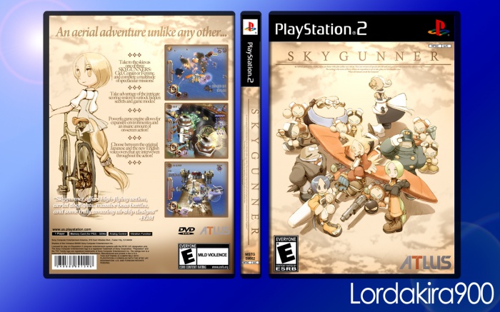
I just bought this game without a case... and I knew I would make cover art for it... but I found out that there is like ZERO high resolution artwork for this game online, so this is the best I could come up with... I hope you like it!
[ Box updated on January 28th, 2012 ] [ original ]
 Skygunner Box Cover Comments
Comment on Lordakira900's Skygunner Box Art / Cover.

The front is, in all respects of the word, superb. The back is a little lacking, but I can understand what you were going for. What's the resolution like for the printable, and would you be willing to put it up?
[ Reply ]
Thank you! I like the front too. And yes, I agree that the back is lacking, but I didn't really know what to do cause I had almost nothing to work with. Maybe I'll come back to this back eventually. The printable is at 300dpi and looks pretty good although I wish the clouds were a little sharper! I'll upload it now though!
[ Reply ]
This needs more attention. I just linked it in my forum sig.
As for the design, I agree with ColonCatastrophe. The back seems a bit dull, but it's still pretty nice. Oh, and I think it would help if you added a 3d template to it, then add a nice presentation (simple though). Even something like this would help imo - link
[ Reply ]
Wow thanks! Yeah, I think in the next few days I might try to redo the back and make it a bit better. Maybe add some screenshots or something. Yeah, I should find a good 3D template so I can start using them, cause I never do but I get this comment a lot.
[ Reply ]
Okay, so I uploaded a new version, taking some suggestions into account. I added more text and some screenshots on the back, and I put the cover in a 3D template. I know the template is really simple, but it's the best I could come up with I guess... and the background is cheesy with the solar flare and all, but oh well haha.
[ Reply ]
A second splendid box in a row. The renders are a little blurry in full printable view, and there's certainly some room for improvement (the tagline is sort of hard to read on the background, and the ESRB and Atlus logos on the front might be a little too close to the bottom), but I'd like to see more from you. Have an author favorite.
[ Reply ]
Thank you!
[ Reply ]
Poor image quality aside, this is lovely work, and the updated back gives off a classic PS2 feel while matching up with the front. I have to say I did like the previous, empty layout as well.
[ Reply ]
Thank you! Yeah I wish I had better images, but what can you do? :)
[ Reply ]
This is just beautiful, the only complaint I have is that the spine logo is off center.
[ Reply ]
Thanks! I think the spine logo looks off center cause the text below the logo is part of it too. But I agree that It looks a little awkward. So maybe I'll revise it and just have "SKYGUNNER" on the spine instead of the whole logo.
[ Reply ]