![]() »
»
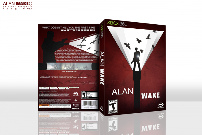
So here is a collab between myself and Leegion! We had a lot of fun with this one and I think the end result really came out great. We went for a more simple approach to a great game. Didnt go full blown minimalism but I really like the way it came out. We worked very well together I think and It would be fantastic to work with him again. I dont really have much else to say. favs and comments appreciated :)
 Alan Wake Box Cover Comments
Comment on Deividas's Alan Wake Box Art / Cover.
Who did the front?
[ Reply ]
I did
[ Reply ]
It was brilliant working on this with you Deividas, and I'd be more than happy to do something like this again in the future.
Proud of the end result here as I've never really worked on anything like this before, so it was a great opportunity to try new things.
[ Reply ]
Since I took a break from this site, alot of great new aspiring artists have risen to the top.
This box is a great example of what you guys are capable of.
The only nitpick I have is that the screenshot borders look a bit bland, but that does not distract me from the beautiful layout the both of you have created.
+fav
[ Reply ]
Considering you split the front/back, they mesh surprisingly well. More so, in fact, than a lot of boxes single designers make. I just love it. Definitely favoriting it.
[ Reply ]
You're absolutely right. If wasn't for the description I would think that this wasn't a collab.
The work here is amazing, and it REALLY blends together very well.
[ Reply ]
The front is amazing. I know that you were going for something simple for the back, but it just comes off as a bit boring. Still, great job to both of you!
[ Reply ]
I L-O-V-E the concept for the front, and while I feel the back is still superbly made, using the same silhouette/flashlight idea was a bit redundant. Still, I'm so impressed that you were able to work together to make a piece of art that's this cohesive, and I'm a huge fan of the non-traditional color scheme you decided to use :D
[ Reply ]
Nice! is that suppose to be a MAGLITE, big battery beasts ;)
some great illustration work and a lot of emphasis on the lightning, which is a very fitting theme on a dark horror/adventure game, great collab guys ;)
It's also the first time the XBOX360 logo just really pops into my vision, which isn't a very good thing, on my behalf :/ I'm sorry, but I must admit, I'm a PS3 owner, if you haven't already guessed it by now?
I Had them all (speaking console-wise) and they either stopped working (my only complain + PSN Downtime which wasn't their fault obviously) or I've sold them afterwards.
so my only complain about the box would be, I can't print this one out and use it as cover :( as it's not a PS3 title. or is it? will it ever be?
[ Reply ]
Excellent, great concept!
[ Reply ]
WOW man it's great!
[ Reply ]
Brilliant. Brilliant. Brilliant. Brilliant. And did I mention Brilliant?
The front, it is honestly and truly brilliant. I want a printable if you're able to provide one.
[ Reply ]
A printable would be very awesome, and I agree with the above about the box. Truly astounding work, and it's great that you actually made a unique Alan Wake box. Being a collab is very nice as well, I wouldn't have known without reading your post. The two sides go together extremely well.
[ Reply ]
Unique.
[ Reply ]
Amazing piece of work from top to bottom.
[ Reply ]
Beautiful. I like how you made it so he's standing on a torch.
[ Reply ]
Wow. Really nice work. I love the red/back/white contrast. Not sure I can even find a fault with this box.
Would this have anything to do with my post in the 'Post Dream Collabs' thread? :P
[ Reply ]
It does. :)
[ Reply ]
Haha. Nice. Glad to see that you actually took my suggestion into action. How'd it happen?
[ Reply ]
I contacted him and we thought of what we could do for a while. I suggested God of War 3 but the idea called for resources that were either low-res, or didn't exist. Then Deividas suggested Alan Wake and showed me the concept for it. I loved the idea and concept and that's how it happened. Very pleased with it.
[ Reply ]
Great stuff.
[ Reply ]
All of the win ever
[ Reply ]
Hmmm. Well I guess I'm going to be the only one that doesn't like this too much. Normally I'd just keep silent, but this is VGBA 3.0 and I think all kinds of criticism are needed now.
I do enjoy the colors a lot. That I can say for sure.
I do think, however that the beam of light on the front should not stop until the edge. XBOX360 logo be damned.
Also, the white edge on the right side is not aligned with the other shades.
I think adding some more birds inside the light beam would do wonders. But not at full opacity, and not all the same size. You know, to give it some dimension.
I can't offer any other solution right now, but I'm really not a fan of the two flashlights on the back, with the beam being the screenshots.
[ Reply ]
This is absolutely wonderful! This site has definitely got back on it's feet, probably due to the redesign.
[ Reply ]
Oh my...
[ Reply ]
Looks great, guys!
[ Reply ]
BAM! Another well deserved HOF! Congrats guys ;)
[ Reply ]
Congrats!
[ Reply ]
Looks amazing! The birds on the back kind of remind me of Stevencho's "The Birds" cover, not that that's a bad thing. ahaha.
It all looks amazing, and everything goes well together. If we still had a masterworks, this box would deserve it.
[ Reply ]
It's fantastic, but...
"deisgns"
[ Reply ]
This may be the best box art I ever saw.
[ Reply ]