![]() »
»
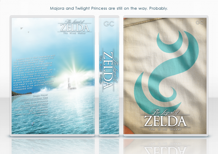
Hi guys,
here's the 2nd installment to my 4 part Zelda box thingy.
I might eventually do more than I planned, but I doubt it. These are the games that feel more like collection to me. Idk.
Anyway.. :P Yeah, this box and stuff.
I felt it pretty well summed up the atmosphere of the game, the sail was just me winging it, I hope it makes enough sense to you. ;P
This, like I said, is the 2nd of 4. Here's the first. :3 I suggest you faving multiple times.
link
...Then buying one of U_F's shirts. C'mon, porn is expensive.
link
---
Anyways, enjoy it! :D
 The Legend of Zelda: The Wind Waker Box Cover Comments
Comment on Eggboy'13's The Legend of Zelda: The Wind Waker Box Art / Cover.
First to say how beautiful this is. I would definitely use this as an actual cover, which I rarely ever say. NICE WORK!
[ Reply ]
Holy shit, man. This is just stunning. Looking at it, especially in combination with the previous one, it makes my pulse jitter. Absolutely beautiful, and a perfect companion piece to its predecessor.
[ Reply ]
I love the imagery on the front and back, but I feel you could have done something better with the description text.
[ Reply ]
Agreed, but this is simply amazing.
[ Reply ]
Damn, this is sexy!
[ Reply ]
For some reason, this makes me feel calm... Weird.
[ Reply ]
Magical mate, simply magical.
[ Reply ]
Amazing.
[ Reply ]
<3<3<3
[ Reply ]
Wow man. This is just... wow
I loved the back, especially the text placement.
[ Reply ]
I love this stuff, it's so unique and well-made.
[ Reply ]
Thank you guys! Looks like I did alright.
[ Reply ]
Gorgeous, this needs to be printed and framed ASAP :p
[ Reply ]
This was probably my favorite cover of yours back when you were unsure if you should continue it. The front image, beautiful in it's simplicity, yet it so clearly and effectively represents one of the major aspects of the game. I immediately think of sailing the Great Sea on the King of Red Lions when looking at that sail.
[ Reply ]
Very easy on the eyes, looks great.
[ Reply ]
I love the front, but the text on the back makes it feel uneven. IDK, I just can't get over the text.
[ Reply ]
Love this!
[ Reply ]
This box has such a serene feel to it, quite unexplainable.
My only gripe is that I feel like the back description could have been executed a little better but it doesn't take anyway anything from the beauty of the box.
[ Reply ]
Holy fucking candy man shit.
[ Reply ]
agreed
[ Reply ]
Oooh I like this
[ Reply ]
this is absolutely beautiful, fav and author fav
[ Reply ]
It's...it's beautiful! Good job. *Faves*
[ Reply ]
Really great. Front is fantastic. The back is also very impressive, but the text is somehow unreadable and seems a bit randomly placed.
Nevertheless, it's fantastic. I don't know, how I could've missed this! :D
[ Reply ]
The composition is absolutely beautiful.
Although I do feel there is something about the logo.. I think it's the fact that you've used outside glow in black on such tiny lettering make it bleed out. You should try and make the black less overpowering in the background and more diffuse. Also, I'm not to happy with the font you used in "The legend of", doesn't fit in.
[ Reply ]
Very creative man, lovely :)
[ Reply ]
Congrats :)
3 HOF's in 1 week.
[ Reply ]
Damn. You guys are on the ball. I mean, damn.
That's like the 3rd one this week. o_O Not that I'm complaining! :P
Thanks!
[ Reply ]
Took it long enough anyway.
Also, where is that Majora's Mask?
[ Reply ]
@willo10 I never started the back.
[ Reply ]
Finish this collection.
And for the love of god, make a printable for the TP one.
[ Reply ]
Very different! It's beautiful. Although, the back cover does not say Zelda to me, but I like it otherwise.
[ Reply ]