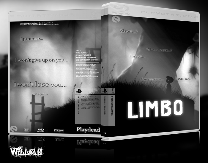
Limbo. Wow, Limbo. I just finished playing through Limbo, and my mind was just blown. This is probably one of the most beautiful video games I've ever played, at least that is downloadable.
As you can probably tell, the box is very sparse and open. Lonely.
I think this captures the Essence of Limbo quite well. During Limbo, the player feels alone, and distant, and I used a lot of black in this box, to symbolize this loneliness.
The images I chose complement this, showing just how alone the player is, how distant he is, and how hopeless you as a player feel.
[ Box updated on January 23rd, 2012 ] [ original ]
 Limbo Box Cover Comments
Comment on willo10's Limbo Box Art / Cover.

I like it.
[ Reply ]
Nothing groundbreaking but still looks pretty neat. The font you used is interesting but I'm not sure if it fits the cover well. Also, that big open empty space at the bottom on the front is bothering me a bit.
[ Reply ]
Well, I really can't think of too much to add to the front, because it's supposed to seem lonely, and that's the look i'm going for. If you have any suggestions on what I should add to the front, I'll certainly add it.
Also, what font do you think would fit the front better?
[ Reply ]
This.
[ Reply ]
Horrible.
[ Reply ]
Aw, come on man, no need to be so harsh. ;)
[ Reply ]
Thanks for the like, though. I appreciate it. :D
[ Reply ]
@willo10 I roll that way.
[ Reply ]
The back is excellent! The front supposed to be lonely/distant as you already mentioned.
Well, you defenitly achieved that kind of feeling in the scene.
I feel like the back already catches that feel, so the empty black space on the front seems kind of unnecessary, if I look at it :/
The 'LIMBO' title on the front should be bigger though imo. if you move it to the center and apply a grey-ish glow around the text, it would merge more with the scene and grabs the attention it needs.
It really has to have something that catches the eye, and atm. it's a bit much with all the black and white and open spaced layout.
[ Reply ]
Okay, I'll see if I can add a goty logo or something. I'll figure it out, I suppose
[ Reply ]
You know, I wasn't actually too satisfied with my original box, so I just went ahead and redesigned it completely. If anyone wants the original printable back, I'd be glad to repost it, but I'm more happy with this version.
It's more like a box, and to me, holds more of the essence of this game than lonliness,
Hopelessness.
[ Reply ]
That's a pretty huge update you've made.
and it has took some different steps, as you already mentioned.
but if this is the feeling you want call on the viewers, I think the previous one has more of lonely feeling, but by adding a bit of text you make it much clearer (I don't really know if it's really the main thing that's going all the way trough the game 'in search of his sister' I've played it, but I just never finished it)
Well, done ;)
[ Reply ]
@Bastart Well, at the end (SPOILER) you find a little girl sitting, and she looks up, and the game ends. This is presumed to be your sister, as even one of the songs in the game is called "Sister".
Also, I'm not sure how you meant this. Are you saying my changes are nor the better, or do you mean the lonely feel of the last box is better.
Sorry, I just wasn't sure. Thanks for the comment. :D
[ Reply ]
@willo10 well, I meant the previous box had a more lonely feel to it imo. I didn't meant that it's better or worse. each version stands on their own. I do like this version better in terms of 'bringing the essence of the game' so I'd say, yeah, it's an improvement.
[ Reply ]