@BoricuArtePR I have played and beaten the game, I still think this looks like a DVD film rather than a PC game, if it were made intentionally to look like a season of a TV show then it would be different. Also I just read that the PC version is FINALLY being released, I was waiting so long I eventually bought an Xbox and played that version. Bought the Xbox cause I got it cheap, not specifically for the game though.
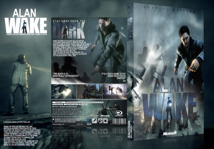
While I do partially share Pan's thoughts on the front, my main problem is with the back, more specifically, the typography.
The tagline is great on it's own, the replication of the official logo is near flawless, and looks more professional than most covers that actually hit store shelves. However, a pattern I've noticed with most of your submissions, is how the synopsis and various features/quotes text are always neatly placed in a corner, or at a side edge, laid out in multiple rows and presented with a standard font.
While it's obviously not necessary to go beyond the basic for every design, something a bit more complex could work for a game like Alan Wake (perhaps reflecting the horror novel narration in which the story is presented?).
 Alan Wake Box Cover Comments
Finally after 32 visitor a fav without comment!
[ Reply ]
It's actually not bad, but it looks too much like a DVD film than a game for my tastes. Also sadly, there is no Windows version, only Xbox.
[ Reply ]
It is actually being released for windows soon.
[ Reply ]
" it looks too much like a DVD film than a game for my tastes "
play the game... that's the intention of the game it feels like a tv series where u have control. try it in my opinion is a great game
in my opinion he achieved what the game is.
[ Reply ]
@BoricuArtePR I have played and beaten the game, I still think this looks like a DVD film rather than a PC game, if it were made intentionally to look like a season of a TV show then it would be different. Also I just read that the PC version is FINALLY being released, I was waiting so long I eventually bought an Xbox and played that version. Bought the Xbox cause I got it cheap, not specifically for the game though.
[ Reply ]
This.
[ Reply ]
Dude its an amazing work for real.
The only thing is... that the Alan that u have on the back looks more appropriate for the front. Just my opinion.
[ Reply ]
agreed.
[ Reply ]
i like the style u have in creating covers.
[ Reply ]
Thanks, Just want cover be more realistic and save the blue coler for
game's scheme.
[ Reply ]
Thanks to all for comments :)
[ Reply ]
While I do partially share Pan's thoughts on the front, my main problem is with the back, more specifically, the typography.
The tagline is great on it's own, the replication of the official logo is near flawless, and looks more professional than most covers that actually hit store shelves. However, a pattern I've noticed with most of your submissions, is how the synopsis and various features/quotes text are always neatly placed in a corner, or at a side edge, laid out in multiple rows and presented with a standard font.
While it's obviously not necessary to go beyond the basic for every design, something a bit more complex could work for a game like Alan Wake (perhaps reflecting the horror novel narration in which the story is presented?).
[ Reply ]
Thanks man, Like usual very helpful comment.
[ Reply ]
I'd have to agree with sd1833 here (which I seem to be doing a lot with comments, haha).
[ Reply ]
the best cover for alan wake so far!
[ Reply ]