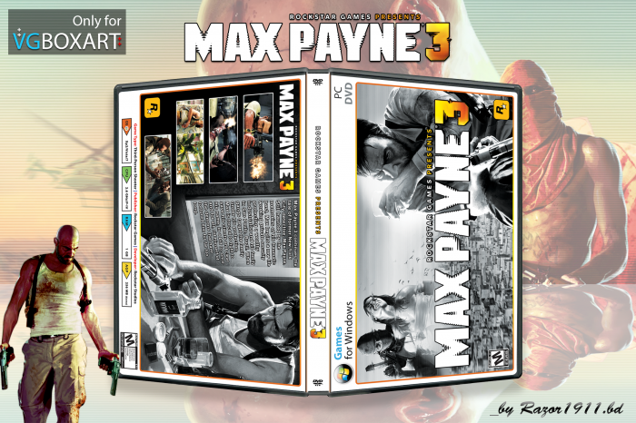
I like it :) The black/white kinda works with the yellow '3'.
I'd suggest high-ligthing a part of Max on both the front and back,
to add more focus and excitement in the picture.
b.t.w. I used the same picture on the back of my MP3
(kinda funny initials for a game) steelbook version. I've
made the front with only a part of the official artwork.
Pretty cool. I don't have much to say in the way of actual critique, as it's pretty fine as is. I would suggest working on the back text, maybe skewing the angle just slightly to match up with the window(?) it's placed against.
Other than that, I like the black/white, and how it places emphasis on the colored text and screenshots.
 Max Payne 3 Box Cover Comments
its a great idea :)
[ Reply ]
Very nice.
[ Reply ]
Pretty well done.
[ Reply ]
I like it :) The black/white kinda works with the yellow '3'.
I'd suggest high-ligthing a part of Max on both the front and back,
to add more focus and excitement in the picture.
b.t.w. I used the same picture on the back of my MP3
(kinda funny initials for a game) steelbook version. I've
made the front with only a part of the official artwork.
[ Reply ]
Pretty cool. I don't have much to say in the way of actual critique, as it's pretty fine as is. I would suggest working on the back text, maybe skewing the angle just slightly to match up with the window(?) it's placed against.
Other than that, I like the black/white, and how it places emphasis on the colored text and screenshots.
[ Reply ]
printable Please
[ Reply ]
Nice Jog! ^^
[ Reply ]