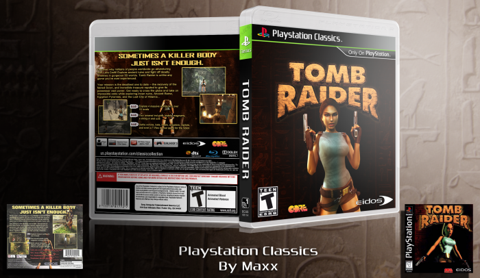
In honor of the new site, I present to you, my first Playstation Classics box! You know the drill, crits and rates always welcome, make sure you check the printable. The template is an edited version of Scorpion Soldier's PS3 template. ENJOY.....and stuff.
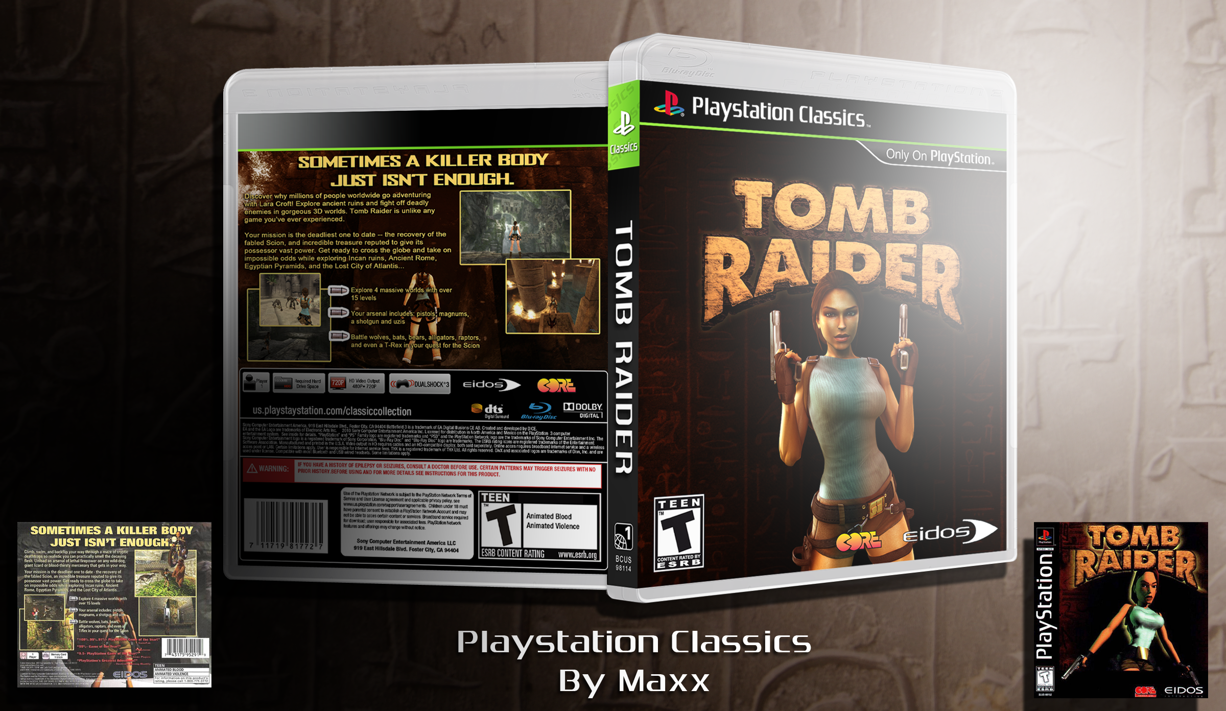
EDIT: So THATS how you edit the description... VERY INTERESTING! Anyway, there is an update, that makes this box even more awesome.
[ Box updated on January 16th, 2012 ] [ original ]
 Playstation Classics: Tomb Raider Box Cover Comments
Comment on madoublex's Playstation Classics: Tomb Raider Box Art / Cover.
Or....dont click the printable... cause it doesn't work.
[ Reply ]
It works for me. Nice box!
[ Reply ]
@twoxT Why thank you :)
[ Reply ]
Very nice remake of the original!
[ Reply ]
The CORE logo on the front seems a bit misplaced imo. it's almost right on top of her V***** :/
just move it a bit to the left next to the 'T' rating.
Other than this, a very nice classic template and a great idea to re-make some PS titles, what's next?
[ Reply ]
Thats a very good question. I tried to remake Einhander but the materials just weren't there. I'm open to suggestions! Also, I'll fix the logo.
[ Reply ]
Perfect remake of the original, especially the back. I think the shine over the box on the front is way too much though.
[ Reply ]
Ok, I will definitely reduce it.
[ Reply ]
UPDATE: I moved the CORE logo over, and I reduced the light in the presentation. ENJOY.....again.
[ Reply ]
much better, but I think you're lazy by not adding a reflection to the box :P only joking ;)
[ Reply ]
@Bastart Shhhhhh.... maybe they wont notice :) Thanks man.
[ Reply ]
Great remake man! Classic ;D
[ Reply ]
It's boxes like this that make me want to go buy a ton of shitty PS3 games, throw the games out, keep the box, and make them all PSX boxes. Nice job.
[ Reply ]
lol
[ Reply ]
Thanks man.
[ Reply ]
Nice but I would like to see more color especially the text on the back which is all the same color.
[ Reply ]
Well, I would have loved to add as much color as I could, but it simply wouldn't be an EXACT remake of the official. The box is actually based off of the, "Greatest Hits," version of the box, and unfortunately, the text on the back is all the same color.
[ Reply ]
@madoublex The synopsis text is a little toned down on the color, compared to the header. It's the same color, but it has slighty less contrast to it, so it seperates the header from the main text not only by the font size itself.
[ Reply ]
@Bastart Ahh, I see now. BACK TO WORK!
[ Reply ]
Cool box! I believe we have similar ideas(check my boxes), ill add this one to my collection, it's really well done
[ Reply ]
Collection?
[ Reply ]
printable boxes i download from the net to print them out
[ Reply ]
@xtrminator05 I see. Thanks man!
[ Reply ]
That template is sick!
[ Reply ]
Why thank you.
[ Reply ]
Even thought it is pretty simple, it works pretty well. You did a great job of recreating the original in a more modern way.
[ Reply ]