Nice. Good to see they finally released more Artwork. But its better to brighten up the colors you put on the artwork. Like make the artwork a bit darker with levels and make the logo white.
#5/#7, the white really didn't look all that nice and the crack effects and stuff I added wouldn't look as nice. It looks much better the way it is I think.
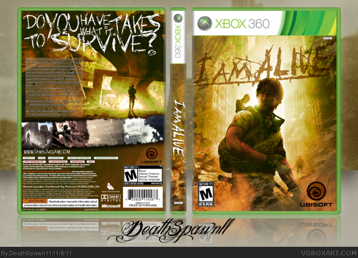
 I Am Alive Box Cover Comments
Shoutout to Titan38 for the temp and stuff.
I know it's supposed to be for the arcade but woops don't care.
View in high res and all that cool stuff.
[ Reply ]
Have my babies?
[ Reply ]
Nice. Good to see they finally released more Artwork. But its better to brighten up the colors you put on the artwork. Like make the artwork a bit darker with levels and make the logo white.
[ Reply ]
Ahhh shyt!
[ Reply ]
I like it a lot. The logo might look better in white but it also might not stand out against the bright sky.
[ Reply ]
Thats pretty sick, yo.
[ Reply ]
Nice.
I would make the logo white to match the tagline on the back.
[ Reply ]
offft.
[ Reply ]
Dude, you're gay for still going on here.
[ Reply ]
#5/#7, the white really didn't look all that nice and the crack effects and stuff I added wouldn't look as nice. It looks much better the way it is I think.
And Jason you're one to talk.
[ Reply ]
It took me like 15 minutes to remember my damn password.
[ Reply ]
Woah, just saw it up close. The res is pretty bad on the guy.
[ Reply ]
Looks cool! Love the tagline.
[ Reply ]
#9, Wait... who the hell are you?
[ Reply ]
#14, A good friend of mine. He's been here almost as long as I have so respect him yo.
[ Reply ]