Thank for you comments. Saren and Shepard, impossible to remove them, they are linked to the story. So which secondary characters sre important enough to be kept?
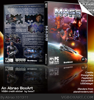
I really like this box, but I think you could've taken up more space for the screenshots' hexagons, and removed that white outer glow (Maybe keeping it there but with more "Size" and less opacity. The front composition is very nice, but you could've tried to lower the opacity of the hexagons pattern close to the border of theplanet and under the characters. The image quality seems very low, also; I'd suggest to save your files as .png or as .jpg with high quality levels.
It's a very nice bx, but there's things that could be improved.
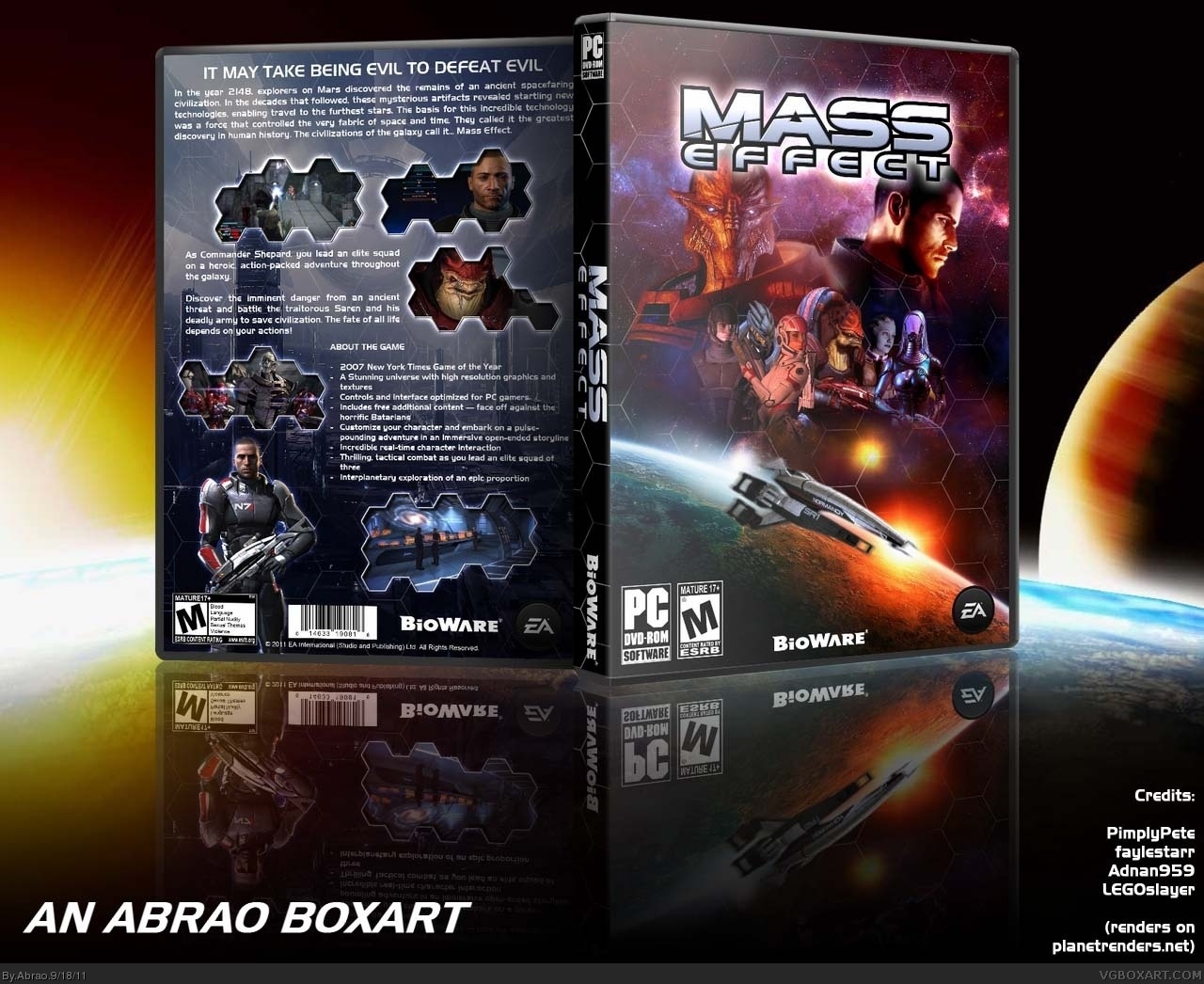
Updated version thanks to #7. Higher quality of the preview now. On the front, the ESRB and the PC logo are now in correct order, and the grid effect has being reduced. On the back, bigger screenshots with smaller hexagons, halo effect was reduced, and the title has now gradient and black contour like the main logo.
 Mass Effect Box Cover Comments
great box but I think you should not have that many characters on the front.
I also like how you placed the screen shots at the back.
Edited at 1 decade ago
[ Reply ]
Thank for you comments. Saren and Shepard, impossible to remove them, they are linked to the story. So which secondary characters sre important enough to be kept?
[ Reply ]
#2, I think it's perfect, but if you're going to remove characters, make sure you keep Garrus and Tali.
[ Reply ]
I think it's fine as is, my only suggestion would be to lower the opacity of the hexagons slightly.
[ Reply ]
#4, you're right, especially on the fringe. I reduced the visibility of the hexagons on the fringe and front.
For the squad members, I'll let them there for now. If more people consider I should reduce the number, I will change them.
[ Reply ]
Box updated with Creative Commons license, and VGBA sticker list.
[ Reply ]
I really like this box, but I think you could've taken up more space for the screenshots' hexagons, and removed that white outer glow (Maybe keeping it there but with more "Size" and less opacity. The front composition is very nice, but you could've tried to lower the opacity of the hexagons pattern close to the border of theplanet and under the characters. The image quality seems very low, also; I'd suggest to save your files as .png or as .jpg with high quality levels.
It's a very nice bx, but there's things that could be improved.
[ Reply ]
Updated version thanks to #7. Higher quality of the preview now. On the front, the ESRB and the PC logo are now in correct order, and the grid effect has being reduced. On the back, bigger screenshots with smaller hexagons, halo effect was reduced, and the title has now gradient and black contour like the main logo.
Comments, suggestions always welcome!
[ Reply ]