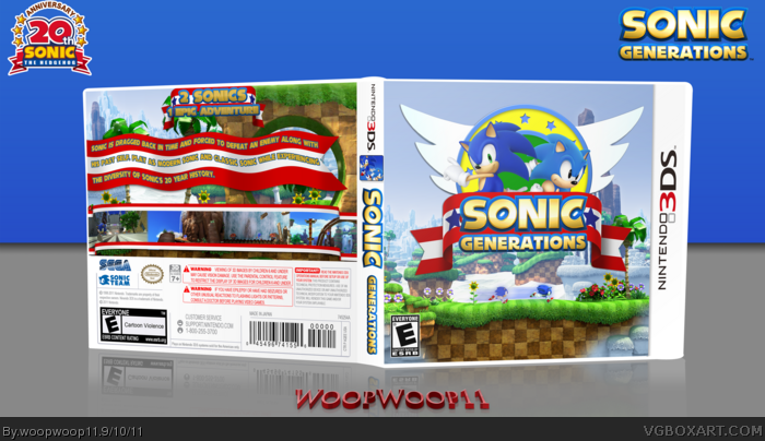
My last Sonic cover. Definitely not one of my best, I am particularly not very satisfied with the way the back came out.I didn't like the shapes on the official logo and cover and based it off of the old title menu logo. I thought the front with good enough to post, and I didn't want to not post a box for the last round of the summer of sonic competition. I'm looking forward to getting this game on 3ds, it looks great. Anyway, I made the template here and the 3d view was based off of a photo I took of an actual 3ds case. Tell me if you like the template and new 3d perspective.
The front is definitely good. But the back kinda seems like the red and white flag was a bit over used. Its fine for the screenshots and the tagline, but maybe you could do something else for the description. All in all, great work.
Yup, just the back is not up to your standards. The text on the flag is a bit out of place, I think. But the front is really well done. Earned your fav today.
 Sonic Generations Box Cover Comments
My last Sonic cover. Definitely not one of my best, I am particularly not very satisfied with the way the back came out.I didn't like the shapes on the official logo and cover and based it off of the old title menu logo. I thought the front with good enough to post, and I didn't want to not post a box for the last round of the summer of sonic competition. I'm looking forward to getting this game on 3ds, it looks great. Anyway, I made the template here and the 3d view was based off of a photo I took of an actual 3ds case. Tell me if you like the template and new 3d perspective.
Edited at 1 decade ago
[ Reply ]
The back seems, I don't, kind of boring? I don't know something's missing. I really liek it though, fav
[ Reply ]
Wow, that's actually very well made! Good Job!
[ Reply ]
The front is definitely good. But the back kinda seems like the red and white flag was a bit over used. Its fine for the screenshots and the tagline, but maybe you could do something else for the description. All in all, great work.
[ Reply ]
Awesome box woop. As you previously stated the back could use a small amount of work but everything else is fav worthy :) great job!
[ Reply ]
Yup, just the back is not up to your standards. The text on the flag is a bit out of place, I think. But the front is really well done. Earned your fav today.
[ Reply ]