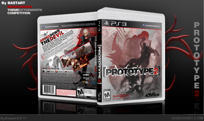
I think I'm the first, but I've spend most of yesterday night and today on finishing this box. The front is made by a traced image of Heller and the Helicopter ('Heller'copter, lol) with an image of Heller at the back screening trough. I've used scanlines, some traced prototype virus to make the borders and accents, some fractal brushes link to accent the jump and some propaganda of the virus on the front.
Credits to Scorpion Soldier and Sens for the templates.
I don't like the front but I understand there is hardly any material on prototype2 so I guess I'm ok with the silhouette.. But I agree with jevangod remove the Random black paint.
I like the back alot, but my only complaint is the positions of the screenshots I don't think towering them fits well.
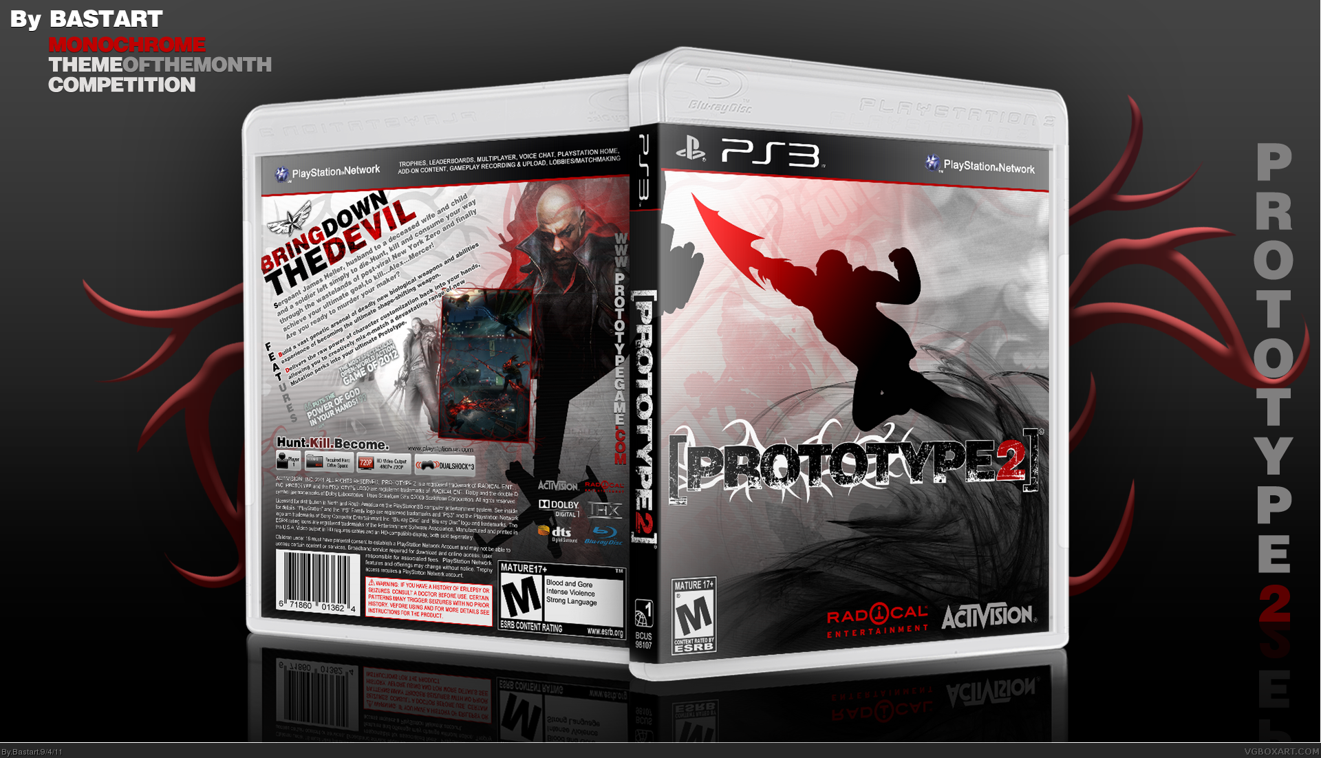
I've completely re-did the front and I made some changes to the borders
and screen placement at the back. I hope you'll like the update ;)
That 'random paint' at the left top corner, was actually a 'machine gun' sticking out from the helicopter vector overlapping the spine. (as it was part of the screenshot link I traced it from) You couldn't really see it on the 3D box,
but on the spread you could see, he's actually jumping towards the helicopter (so that's why, it was there)
it doesn't really matter now, as I removed it from the left top corner.
#10, Thanks, I really was quite unsure which front image to go with?
until I decided to use the artwork that will (when they release it) be quite overused, I guess?
so, I decided to trace a couple more silhouettes of Heller to make it more original.
My question is;
Should I change it again with a silhouette and post it in the WIP? or should I stick with this artwork image?
I'm really unsure, because I want this to turn out pretty decent for the competition.
#13, Go ahead, but I think You should wait until more Prototype 2 boxes are posted, because the sources you'll find of this game are very slim atm. so I should wait until more artwork of the game is released and someone else, will definitely make something more colorful and flashier than I did with mine :/ (this is for a competition, so there are some limitations with colors)
#15, Thanks ;) Yeah, I'm quite struggling with the front. I made some traced silhouettes of James Heller and experimented combining a picture of Alex Mercer on the front. I'd really appreciate it, if you could leave your
opinion about the updates I've made, it's in the WIP thread.
#18, Thanks, but I don't think the front looks to be all that appealing? (due the lack of comments about it)
Despite all the work I put on the front :( I even posted it at the WIP to improve it. It's still lacking something,
I suppose? :/
Maybe, I'll have to wait till there's more material to work with? I'm thinking about re-entering the competition,
with a completely different game that has more sources. (and I'll put this one on a hold, to continue later on)
 Prototype 2 Box Cover Comments
I think I'm the first, but I've spend most of yesterday night and today on finishing this box. The front is made by a traced image of Heller and the Helicopter ('Heller'copter, lol) with an image of Heller at the back screening trough. I've used scanlines, some traced prototype virus to make the borders and accents, some fractal brushes link to accent the jump and some propaganda of the virus on the front.
Credits to Scorpion Soldier and Sens for the templates.
Edited at 1 decade ago
[ Reply ]
I really like the back but not the front.
[ Reply ]
#2, You don't like the Heller silhouette on the front?
I can't do nothing about it, if you just say that you don't like it :/ if you know what I mean?
Could you be a bit more specific, please?
Edited at 1 decade ago
[ Reply ]
Whats up with the random black paint on the front, top left.
[ Reply ]
I don't like the front but I understand there is hardly any material on prototype2 so I guess I'm ok with the silhouette.. But I agree with jevangod remove the Random black paint.
I like the back alot, but my only complaint is the positions of the screenshots I don't think towering them fits well.
Make these changes and I will definitely fav.
Edited at 1 decade ago
[ Reply ]
BAM! Update.
I've completely re-did the front and I made some changes to the borders
and screen placement at the back. I hope you'll like the update ;)
That 'random paint' at the left top corner, was actually a 'machine gun' sticking out from the helicopter vector overlapping the spine. (as it was part of the screenshot link I traced it from) You couldn't really see it on the 3D box,
but on the spread you could see, he's actually jumping towards the helicopter (so that's why, it was there)
it doesn't really matter now, as I removed it from the left top corner.
Anyway, thanks guys for the advice.
Edited at 1 decade ago
[ Reply ]
I like the 1st front more. But the screenshot placement is better however one is covering Heller a bit too much.
[ Reply ]
#7, I'm sorry, but I'm sticking with this one :/ if you like it or not (sarcasm)
Edited at 1 decade ago
[ Reply ]
#8, Ur choice.....
[ Reply ]
Awesome!
[ Reply ]
#10, Thanks, I really was quite unsure which front image to go with?
until I decided to use the artwork that will (when they release it) be quite overused, I guess?
so, I decided to trace a couple more silhouettes of Heller to make it more original.
My question is;
Should I change it again with a silhouette and post it in the WIP? or should I stick with this artwork image?
I'm really unsure, because I want this to turn out pretty decent for the competition.
Edited at 1 decade ago
[ Reply ]
#11, I really liked the second version. It fits in more with the back.
[ Reply ]
Is it ok if i use this for my copy of the game? Because i can already tell this will be better than the original.
[ Reply ]
#13, Go ahead, but I think You should wait until more Prototype 2 boxes are posted, because the sources you'll find of this game are very slim atm. so I should wait until more artwork of the game is released and someone else, will definitely make something more colorful and flashier than I did with mine :/ (this is for a competition, so there are some limitations with colors)
Edited at 1 decade ago
[ Reply ]
Love the back but the front seems a bit empty to me.
[ Reply ]
#15, Thanks ;) Yeah, I'm quite struggling with the front. I made some traced silhouettes of James Heller and experimented combining a picture of Alex Mercer on the front. I'd really appreciate it, if you could leave your
opinion about the updates I've made, it's in the WIP thread.
Edited at 1 decade ago
[ Reply ]
I've updated the front.
Thanks to all who shared their opinion at the WIP thread ;)
[ Reply ]
very good job in the back,
[ Reply ]
#18, Thanks, but I don't think the front looks to be all that appealing? (due the lack of comments about it)
Despite all the work I put on the front :( I even posted it at the WIP to improve it. It's still lacking something,
I suppose? :/
Maybe, I'll have to wait till there's more material to work with? I'm thinking about re-entering the competition,
with a completely different game that has more sources. (and I'll put this one on a hold, to continue later on)
What do you think, I should do?
Edited at 1 decade ago
[ Reply ]
Awesome, the front is much better now and this definitely deserves more attention! +FAV
[ Reply ]
The Back is Amazing. The Front, a little less. ;) But Still Worth a +Fav :D
[ Reply ]