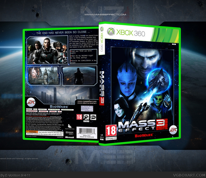
That's a pretty impressive arrangement on the front. The composition is spot on, although I must admit it's strange seeing Thane's head obstructed by Earth, rather than vice versa. Good work.
Very nice but a few things bug me about the front, like the Bioware logo above the ME logo. Why not move it outside the border?
And also what sd said about Thane's head.
Other than these issues, I love it.
About Thane's head, I wanted the battle between the Normandy and the Reaper to be on the foreground so I had no other choice than hide the top of Thane's head.
And about the Bioware logo, it might be a mistake but when I did it, it seemed cool to me.
#4: I see what you mean. You did replicate the image from the Star Trek poster quite well, it's an accurate portrayal. The difference, I think, is that the character's head on the poster tends to fade out as the image of the ship begins. The glow behind it is more prominent too, and it doesn't seem as abrupt of a change.
indeed it is amazing! but, I agree with #5 I suggest to fade out the character's head as the image of the moon appears. Now it looks a bit like he's wearing a planet on his head ;)
The front as a whole kinda had a Lucas Arts feel to it. I dont know why though. Amazing box nonetheless! I do agree you should move the bioware logo down onto the border.
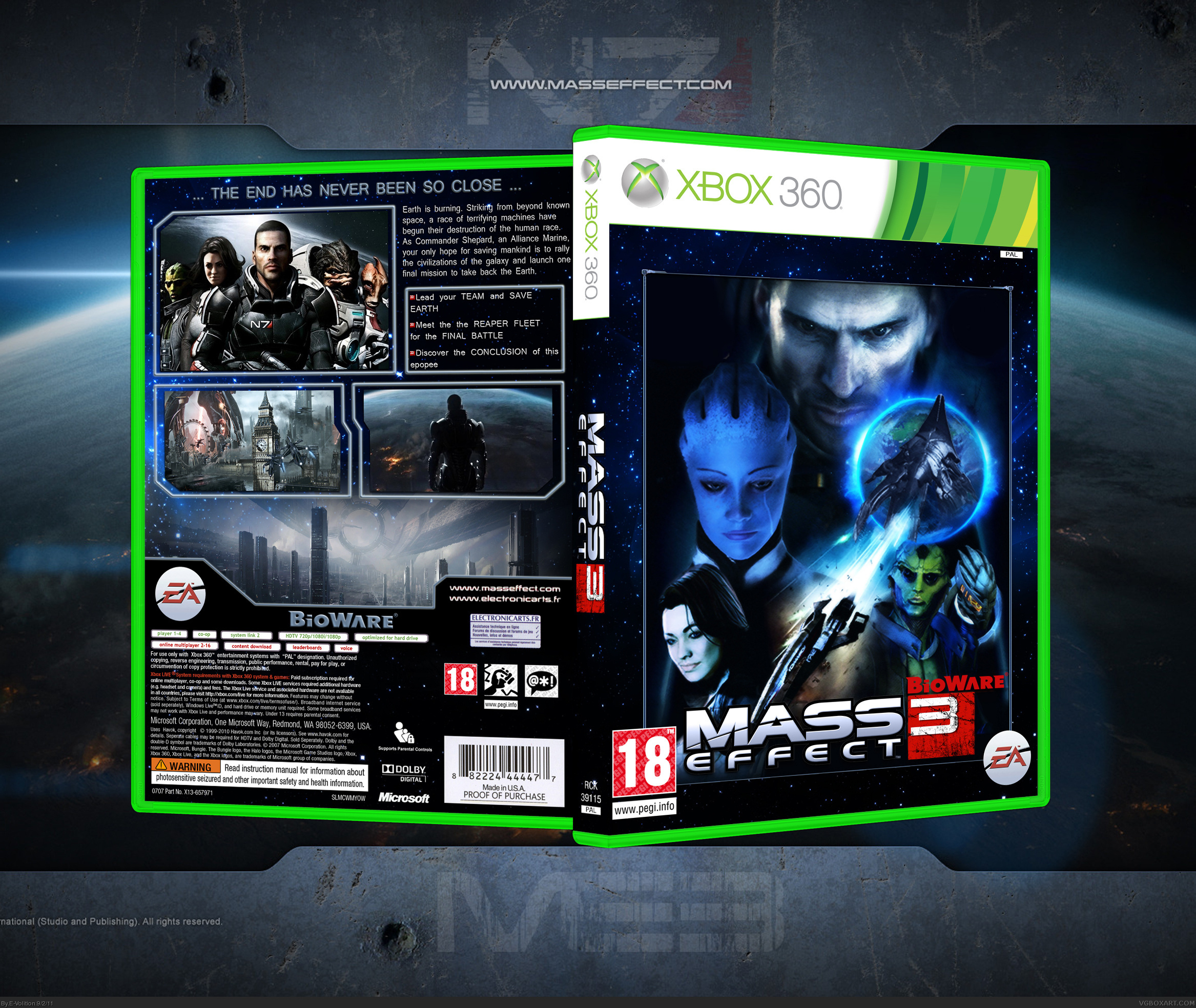
I actually don't really care about the Bioware logo on the front at version 1, it doesn't look to distracting. I can see why some people dislike it, but I'm cool with it :) You've nailed it, the update looks way better (Thane's head) I'm ready to fav ;)
 Mass Effect 3 Box Cover Comments
My second Mass Effect 3 boxart. The front is inspired from this Star Trek poster : link
Credit : Scorpion Soldier (Template)
[ Reply ]
That's a pretty impressive arrangement on the front. The composition is spot on, although I must admit it's strange seeing Thane's head obstructed by Earth, rather than vice versa. Good work.
[ Reply ]
Very nice but a few things bug me about the front, like the Bioware logo above the ME logo. Why not move it outside the border?
And also what sd said about Thane's head.
Other than these issues, I love it.
[ Reply ]
About Thane's head, I wanted the battle between the Normandy and the Reaper to be on the foreground so I had no other choice than hide the top of Thane's head.
And about the Bioware logo, it might be a mistake but when I did it, it seemed cool to me.
[ Reply ]
#4: I see what you mean. You did replicate the image from the Star Trek poster quite well, it's an accurate portrayal. The difference, I think, is that the character's head on the poster tends to fade out as the image of the ship begins. The glow behind it is more prominent too, and it doesn't seem as abrupt of a change.
Either way, this still looks great.
[ Reply ]
It looks good but I dislike the placement of the BioWare logo.
[ Reply ]
This should have more attention. It's amazing!
[ Reply ]
indeed it is amazing! but, I agree with #5 I suggest to fade out the character's head as the image of the moon appears. Now it looks a bit like he's wearing a planet on his head ;)
[ Reply ]
The front as a whole kinda had a Lucas Arts feel to it. I dont know why though. Amazing box nonetheless! I do agree you should move the bioware logo down onto the border.
[ Reply ]
Thanks for comments everybody. I'm going to make a V2 in order to correct the defaults you noticed (Thane's head and Bioware logo)
[ Reply ]
printable ver would be great
[ Reply ]
Box updated and printable version added :)
[ Reply ]
I actually don't really care about the Bioware logo on the front at version 1, it doesn't look to distracting. I can see why some people dislike it, but I'm cool with it :) You've nailed it, the update looks way better (Thane's head) I'm ready to fav ;)
Edited at 1 decade ago
[ Reply ]